CLIENT BRIEF
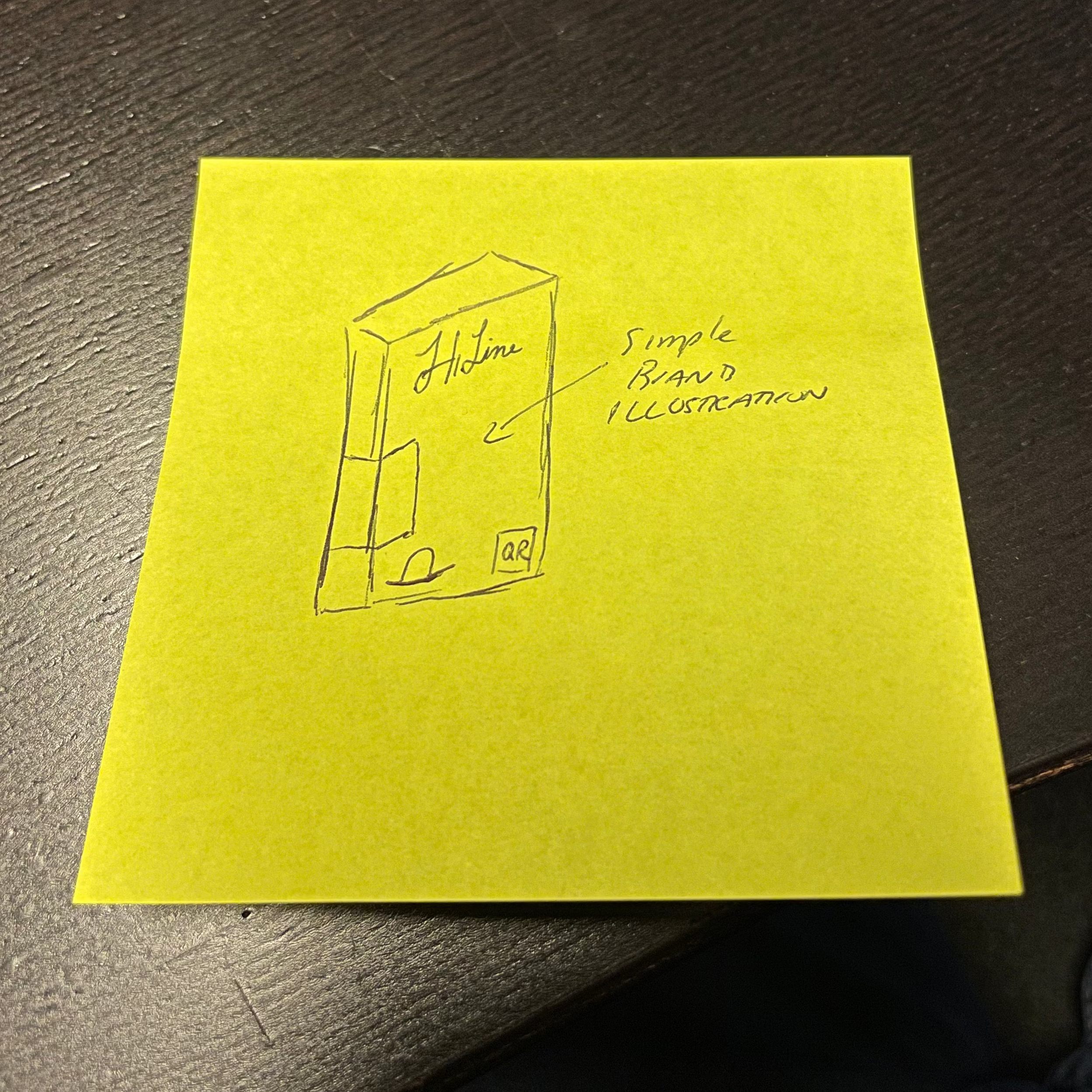
HiLine Coffee approached us to elevate the look and feel of their Nespresso capsule line. Previously packaged in a standard stand-up pouch, the brand wanted to transition to a more premium carton format that better reflected their craftsmanship and professionalism. With only a logo, font, and basic color system in place, our team was tasked with developing a complete visual direction from the ground up, one that would capture the brand’s personality while standing out in the crowded coffee capsule market. As a Staten Island–based roaster with a daily view of the Manhattan skyline, HiLine wanted the new design to pay homage to New York City in an authentic and lighthearted way. The client even sent over a simple sticky-note sketch (shown below) to help guide the direction and tone he envisioned for the artwork. His only creative requests were that the packaging remain clean, modern, and fun, and that it incorporate hand-drawn elements to add a human, artisanal touch. The result needed to feel unmistakably “New York,” approachable yet refined, and worthy of the quality coffee inside
PROJECT DESCRIPTION
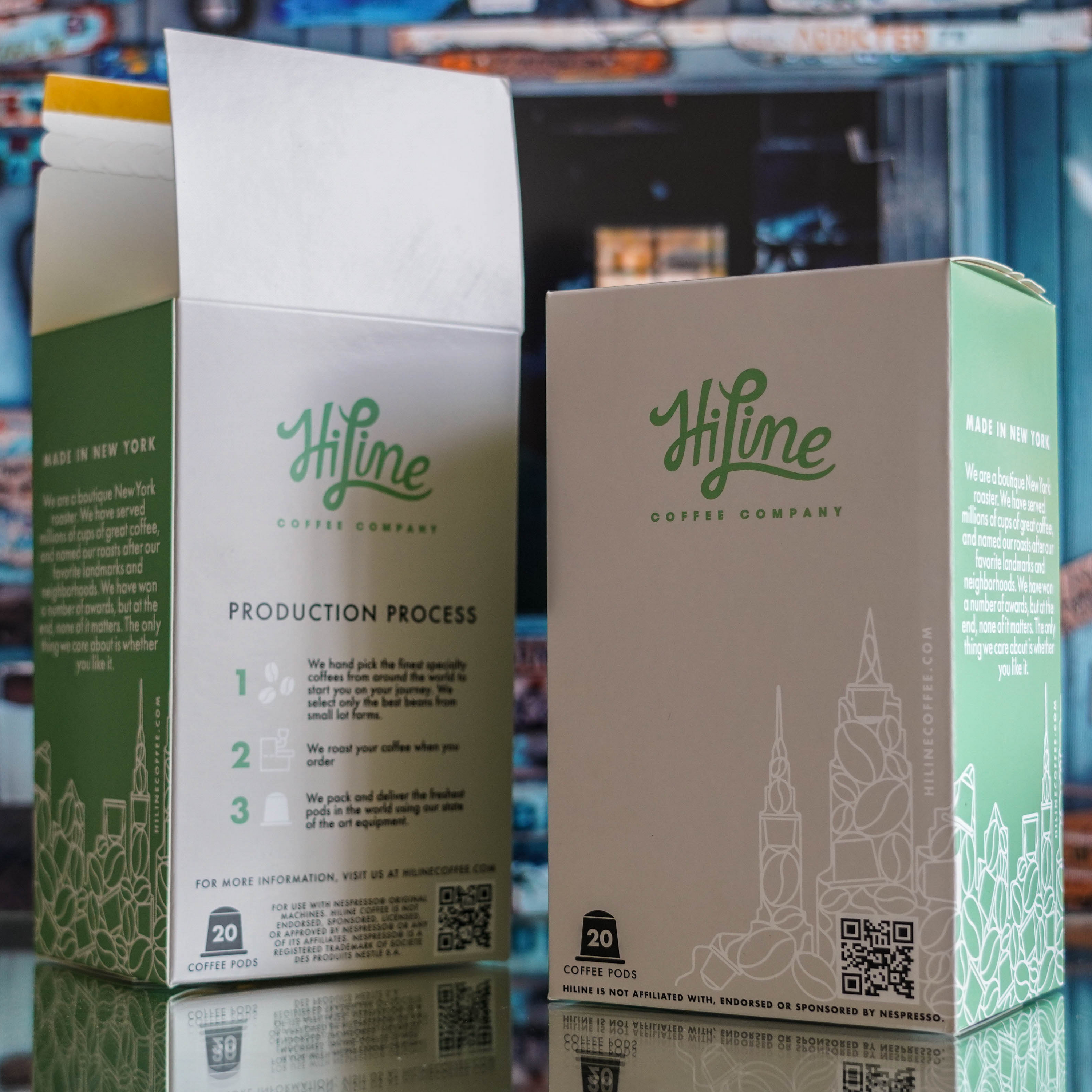
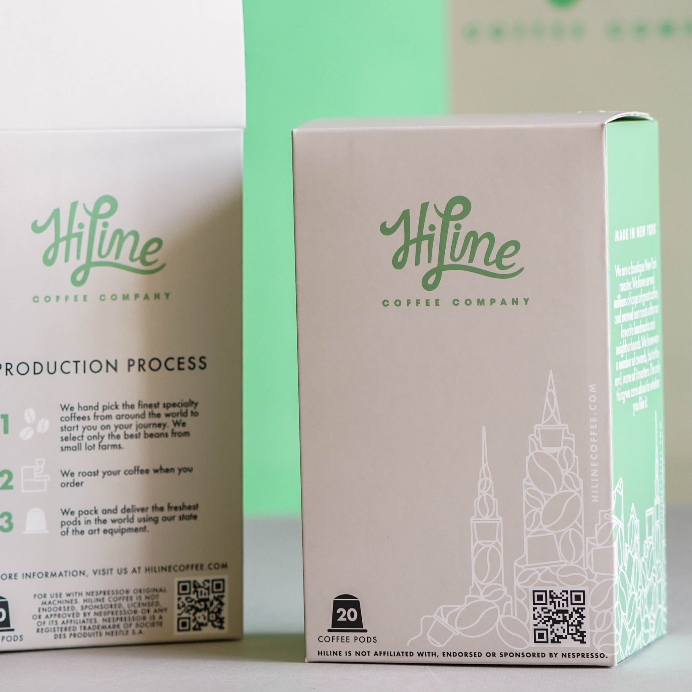
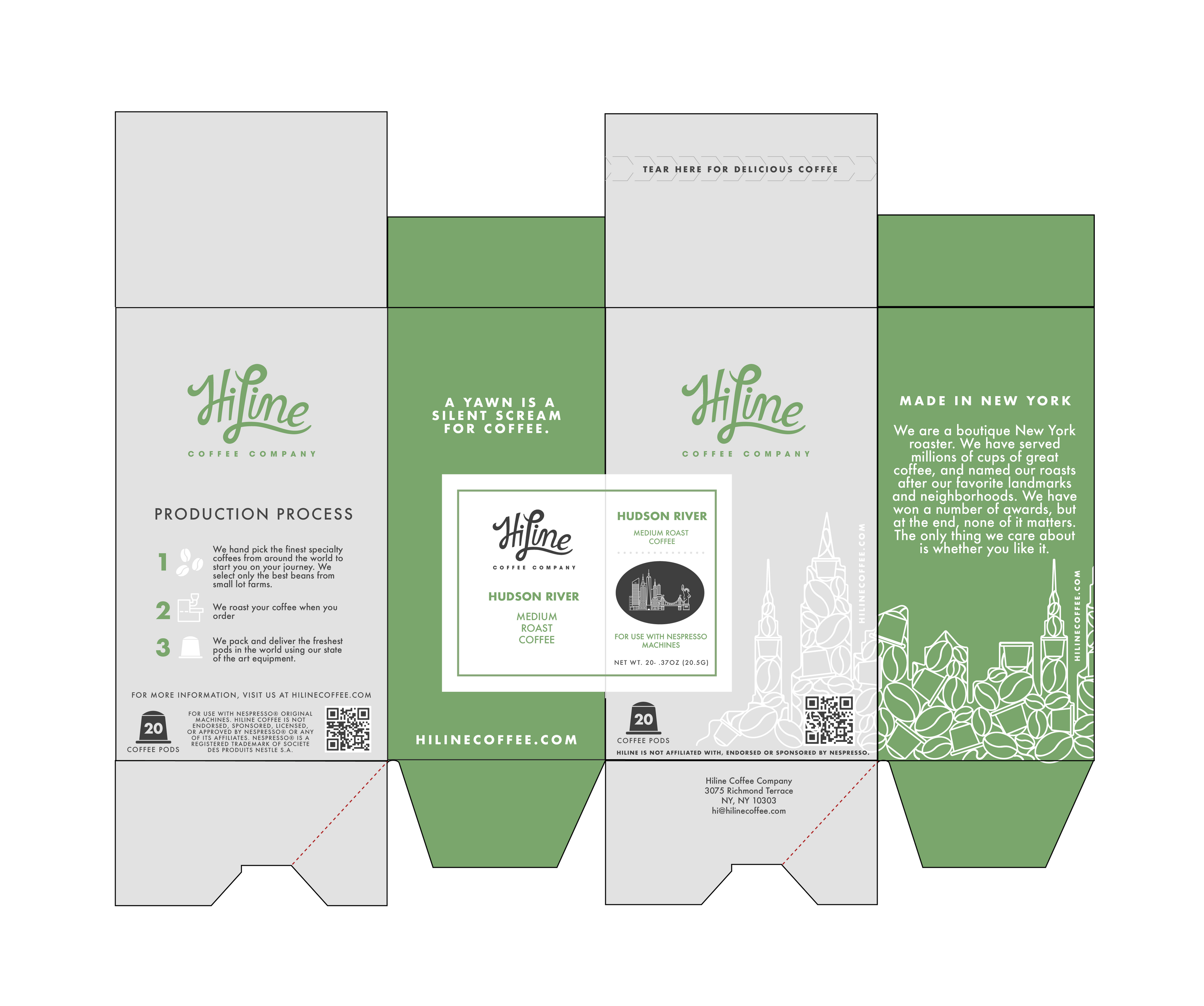
Building from the client’s sticky-note sketch and creative direction, we developed a carton design that captures the charm and energy of New York City while maintaining HiLine’s approachable, modern aesthetic. Using hand-drawn linework, we illustrated an abstracted skyline made of coffee beans that wraps around the box—subtly referencing the Manhattan view from HiLine’s Staten Island roastery without overwhelming the design.
We paired this illustration with a fresh, minimalist layout that balances personality and professionalism. A mint-green color block anchors each SKU, providing strong shelf visibility and easy flavor differentiation, while the white base keeps the overall composition clean and sophisticated. Typography was refined to enhance legibility and hierarchy, and playful copy lines, such as “A yawn is a silent scream for coffee,” add warmth and wit. The end result is packaging that feels distinctly New York: crafted, confident, and full of character, perfectly aligned with HiLine’s identity as a local roaster with big-city style.
before & after
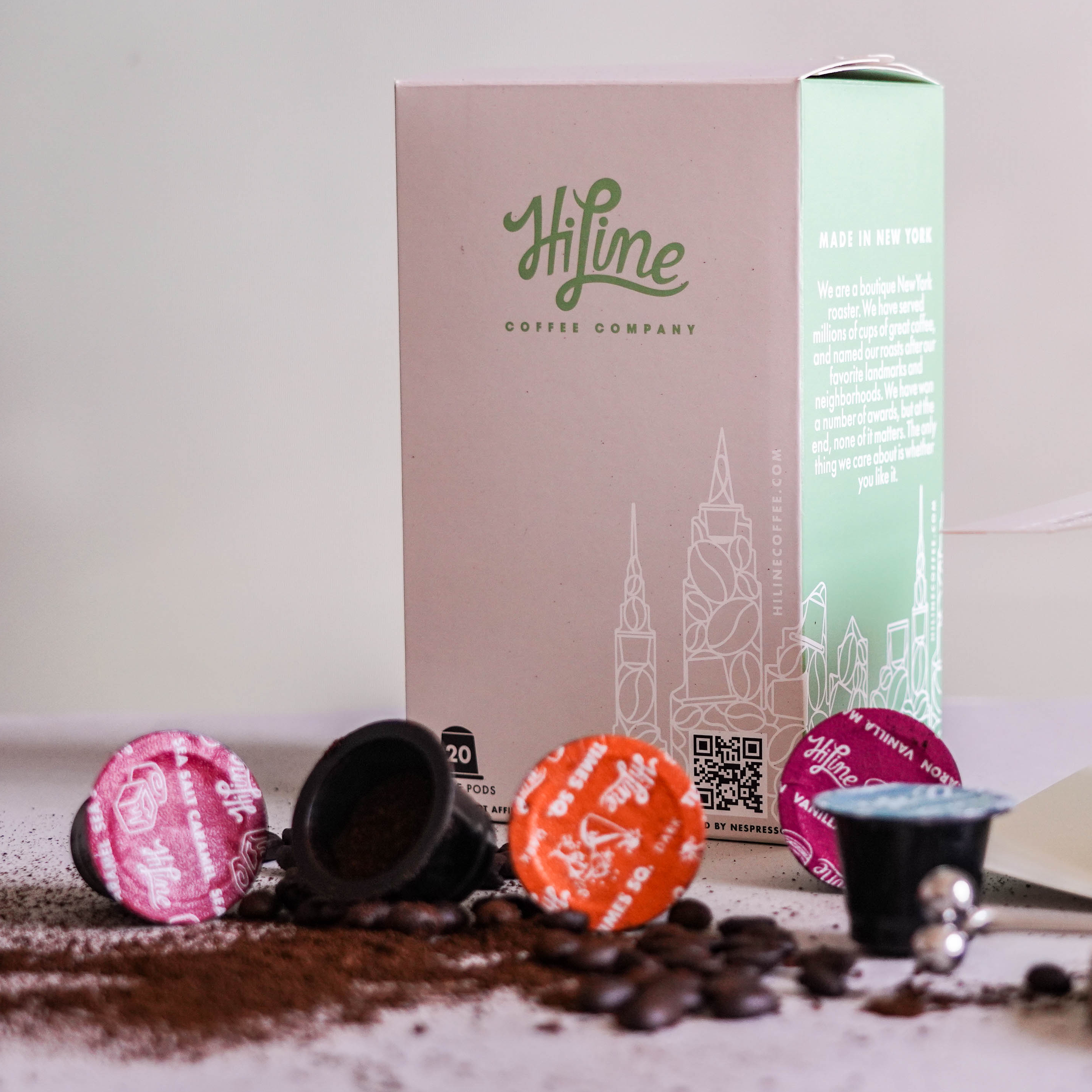
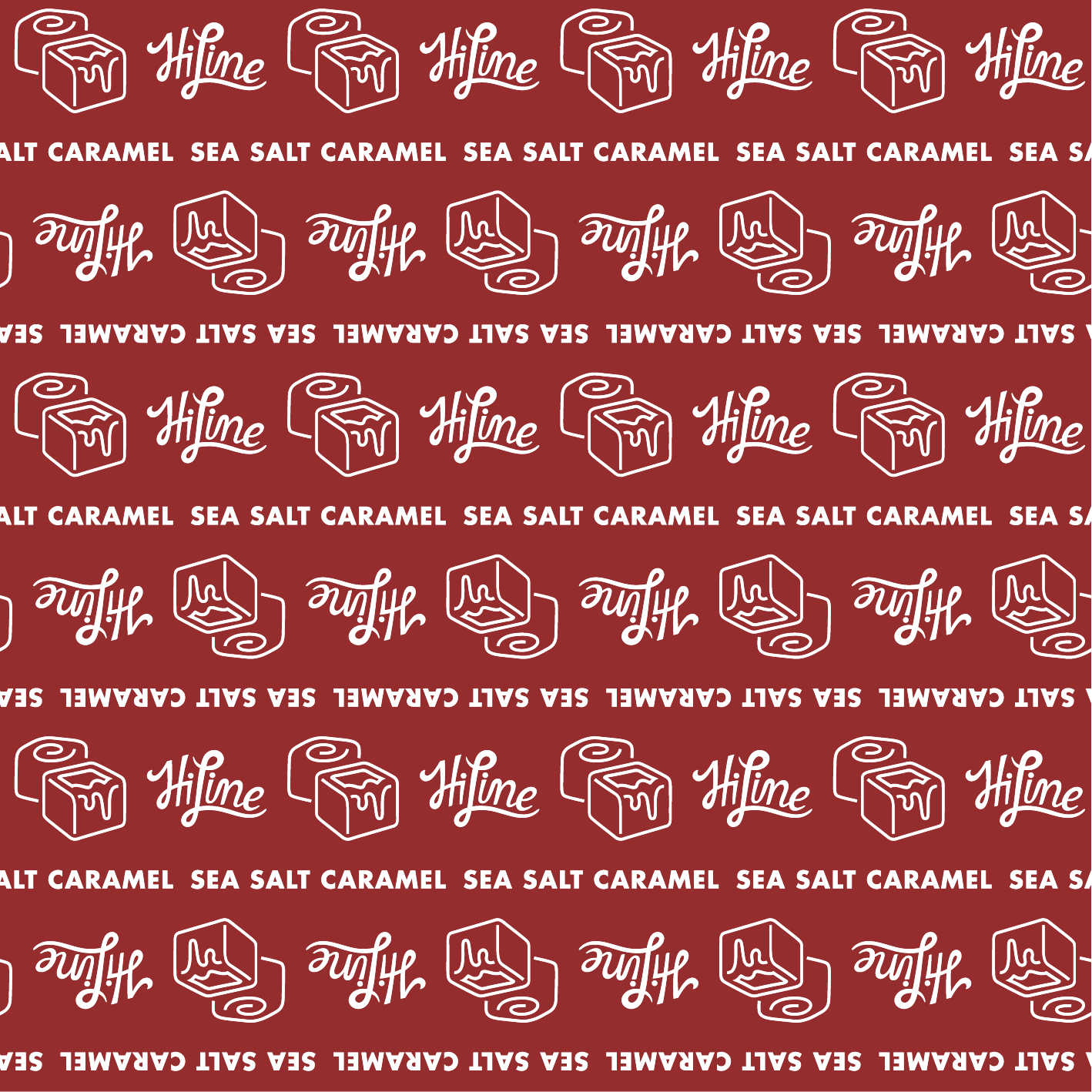
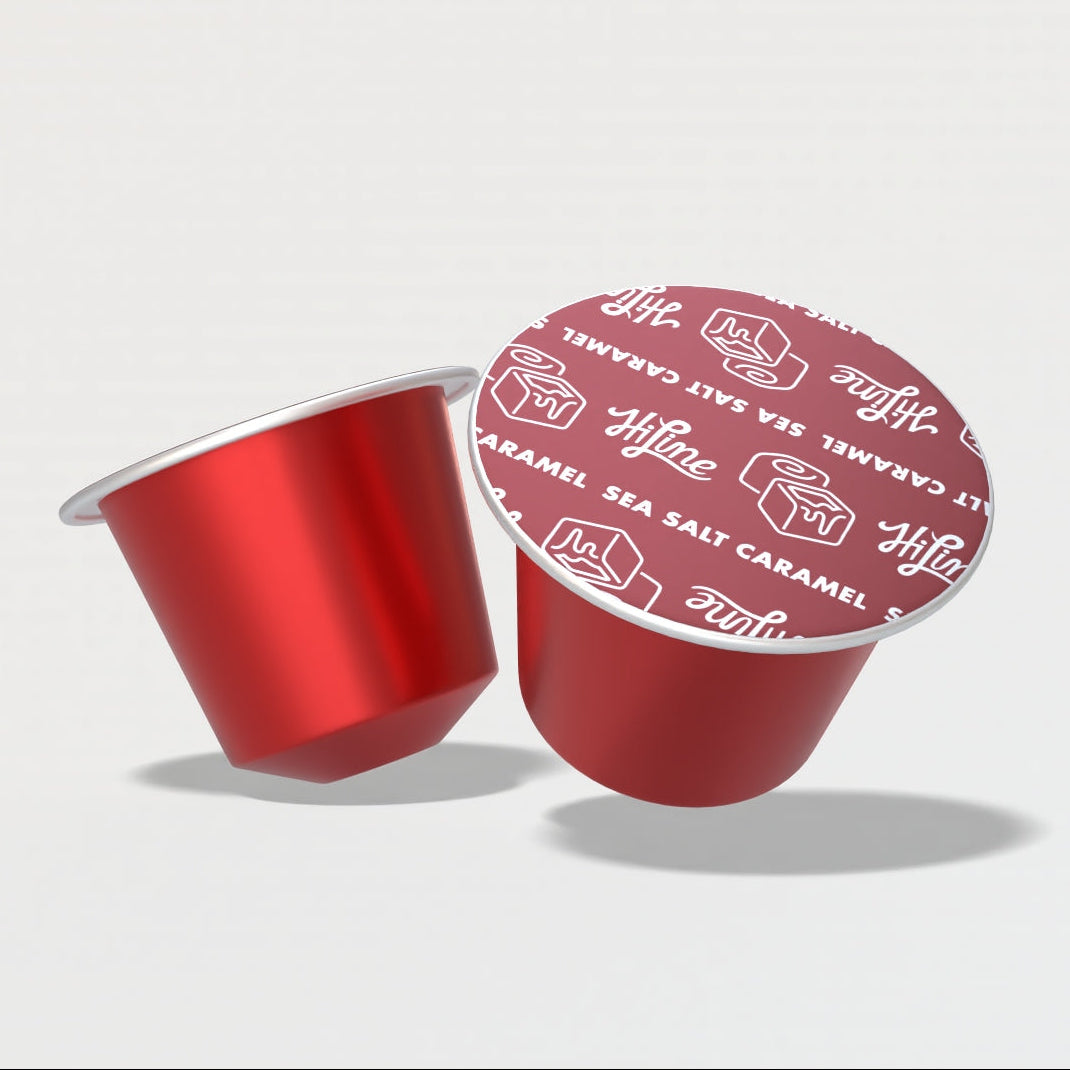
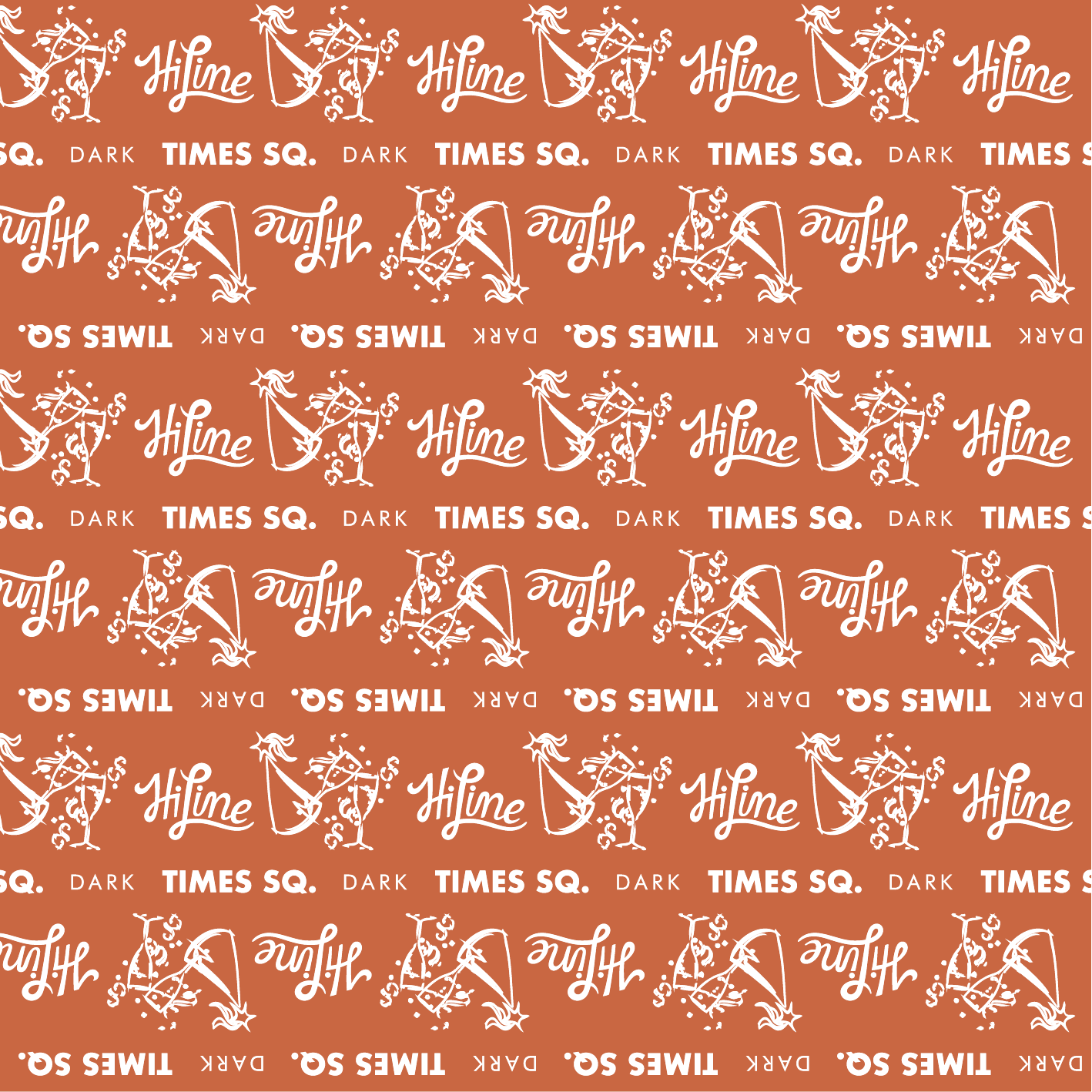
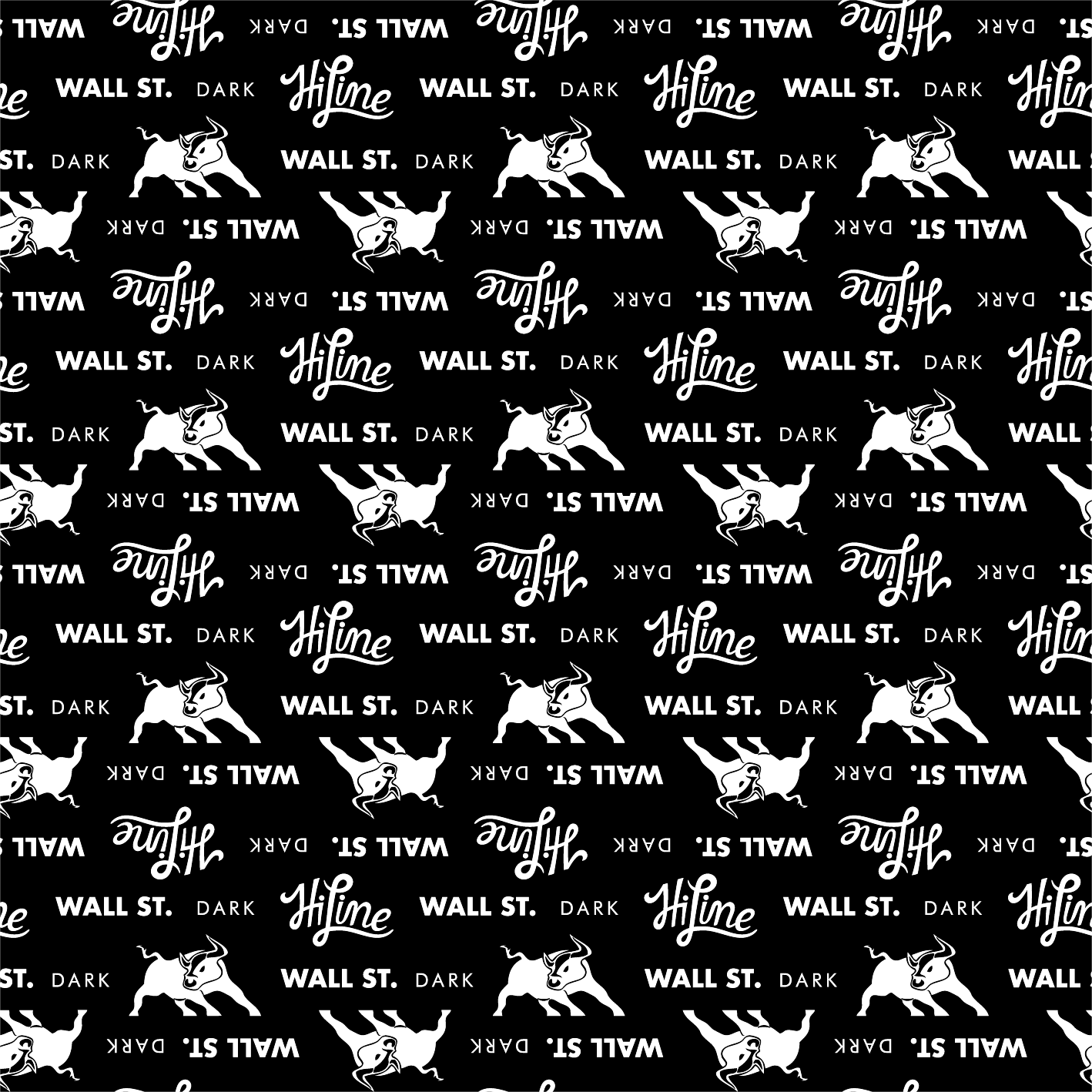
LIDDING ARTWORK
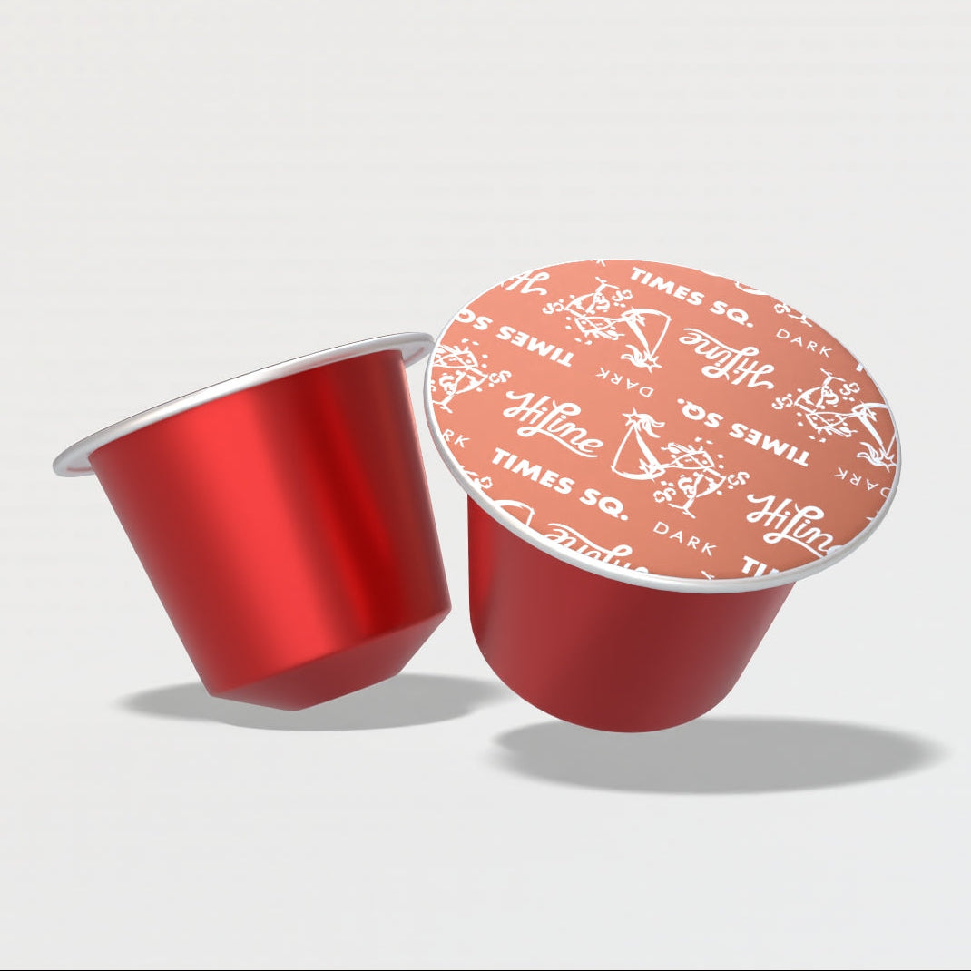
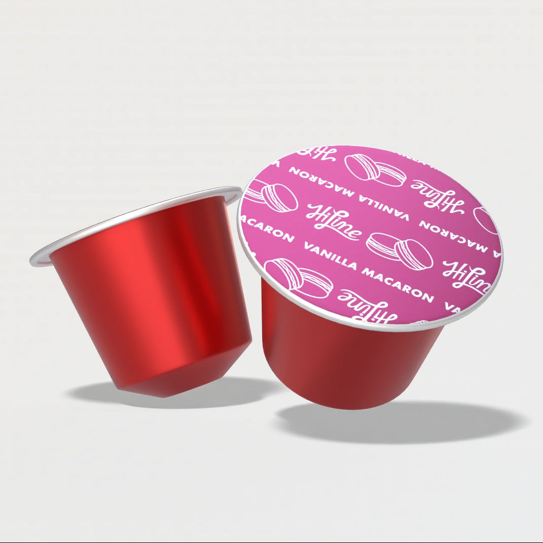
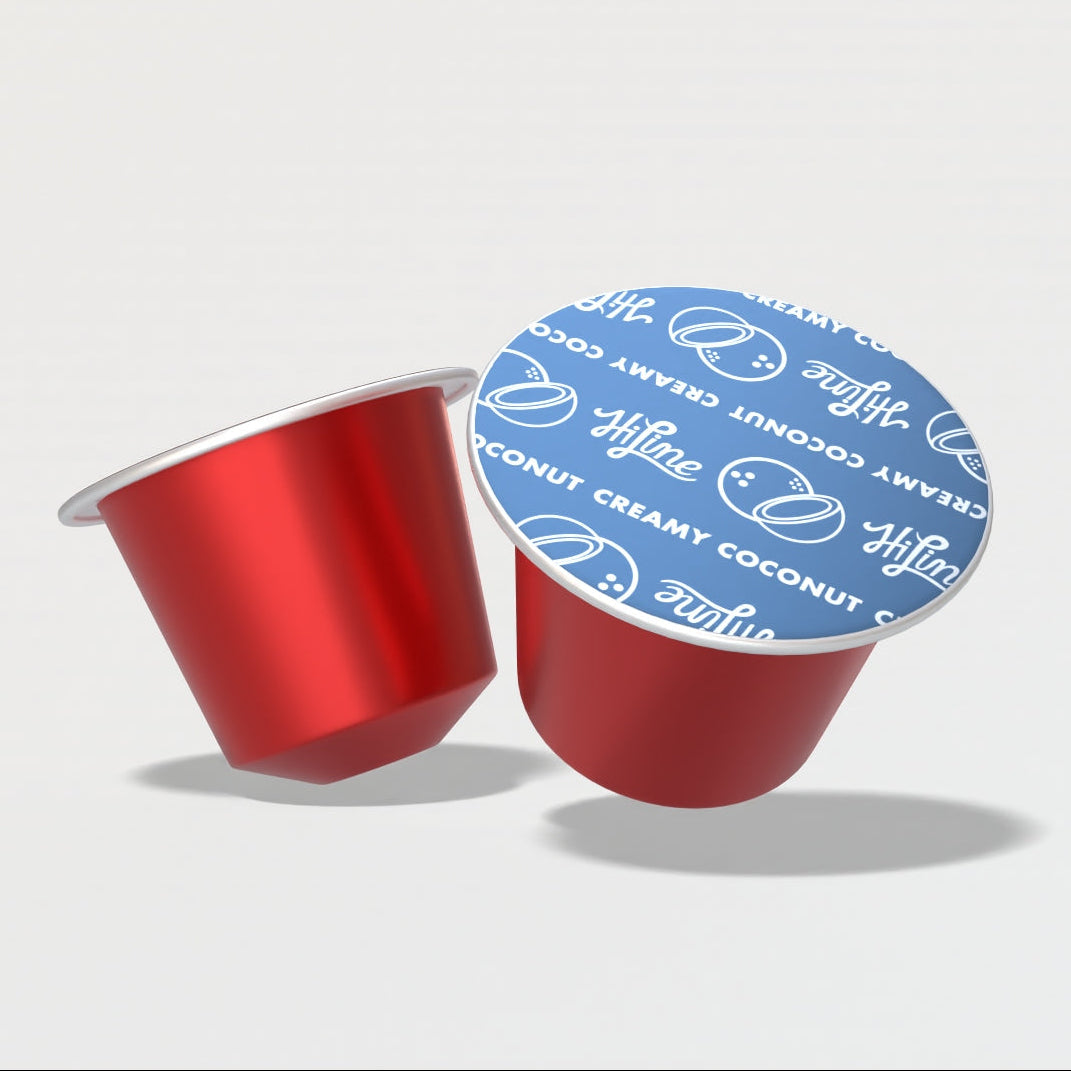
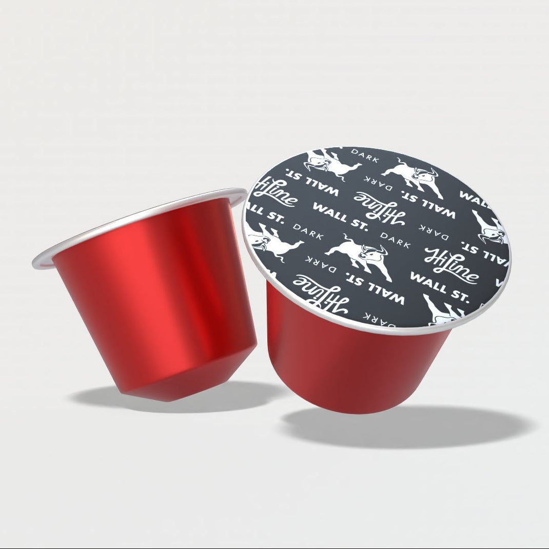
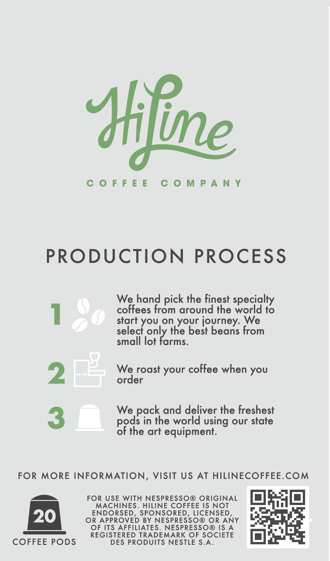
Final Approved Design
Shop this coffee