PROJECT DESCRIPTION
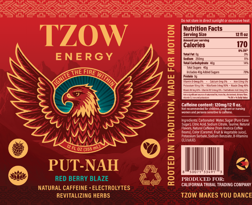
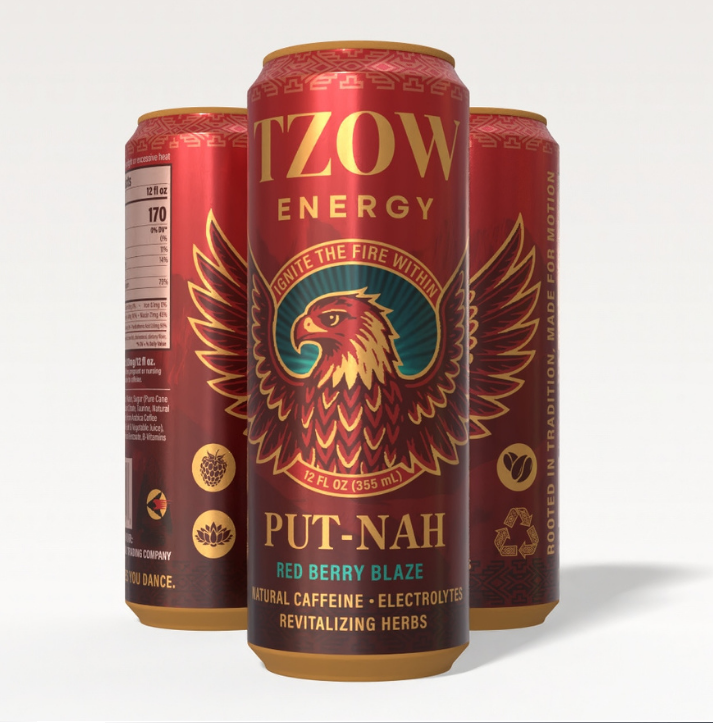
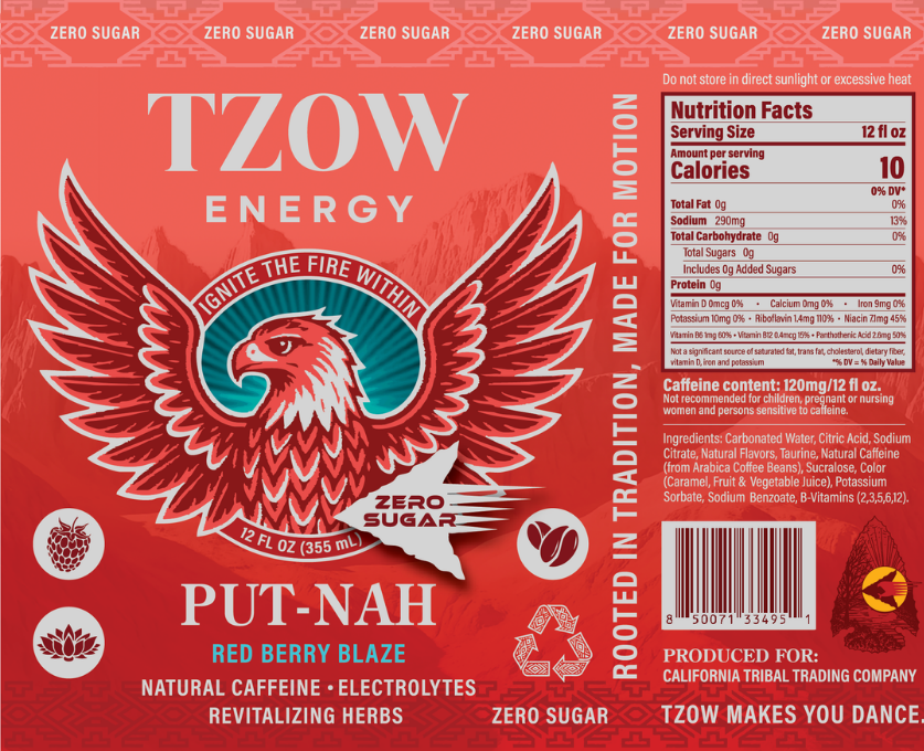
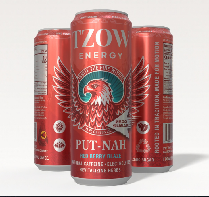
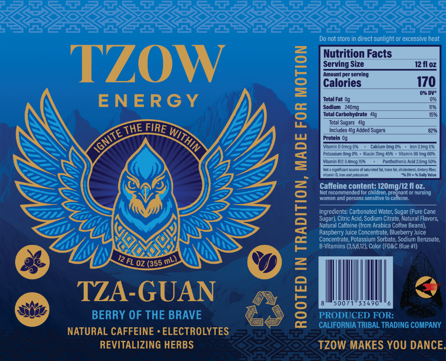
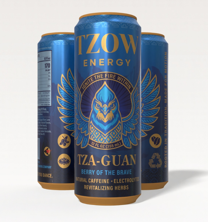
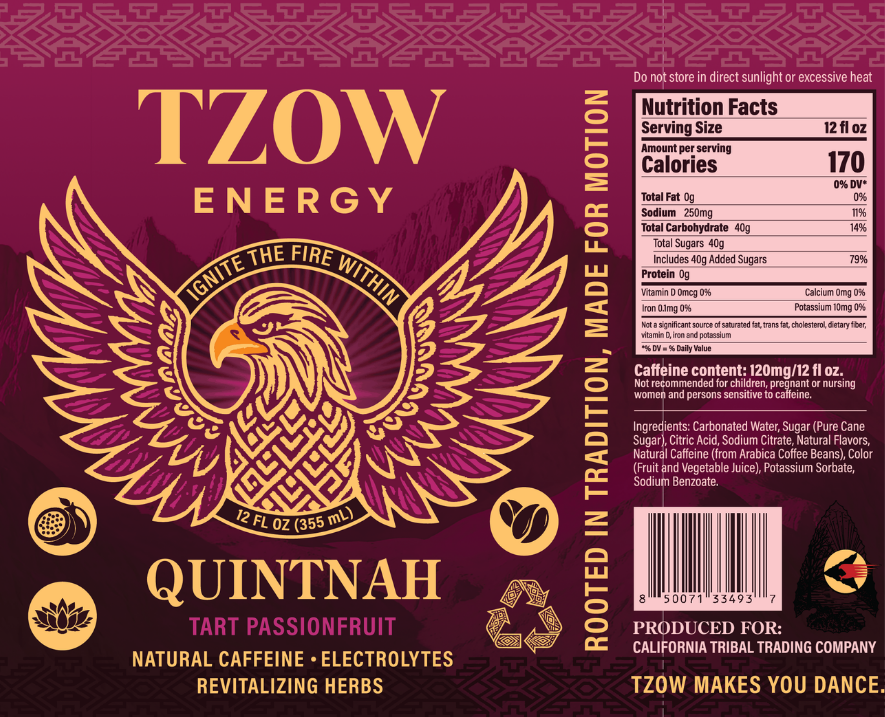
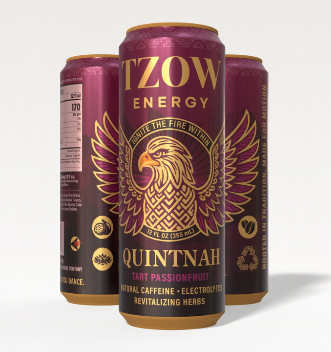
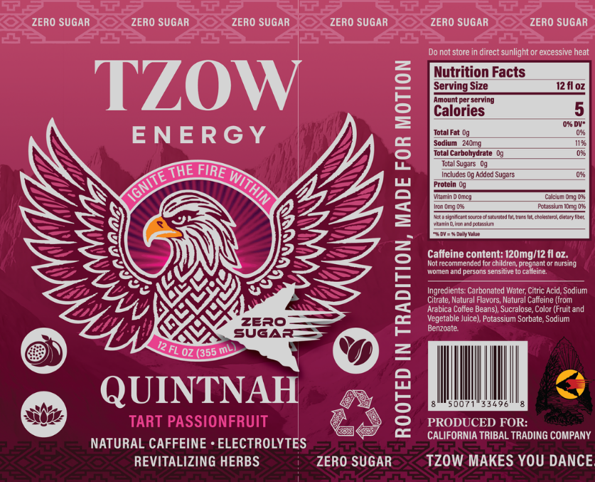
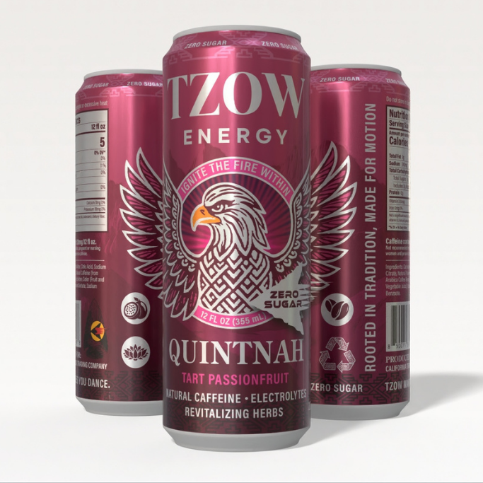
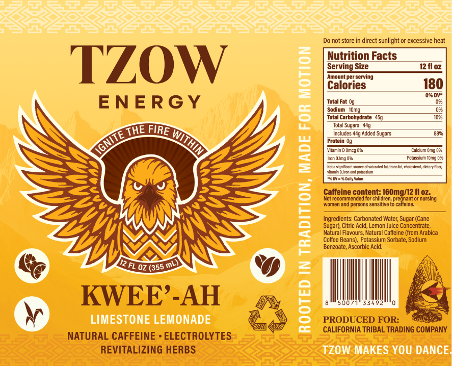
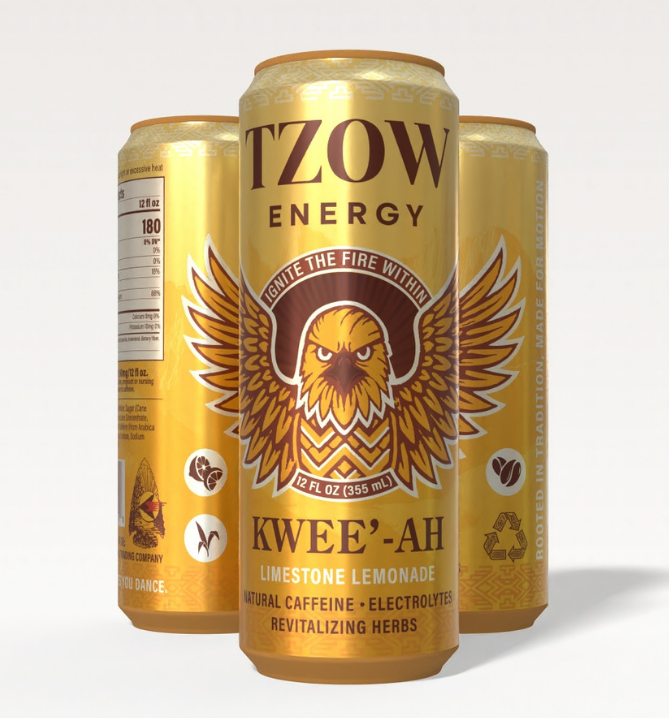
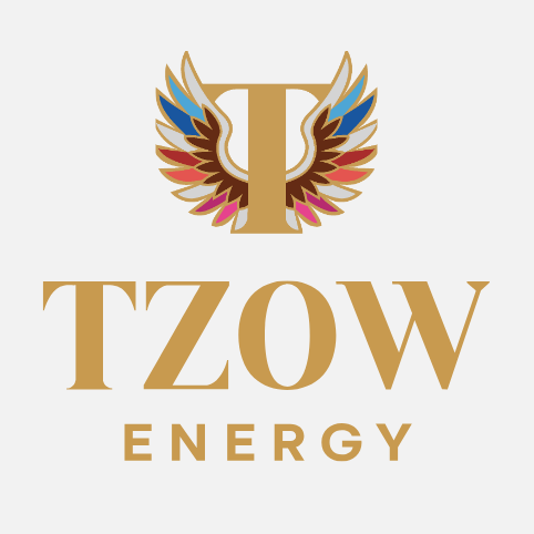
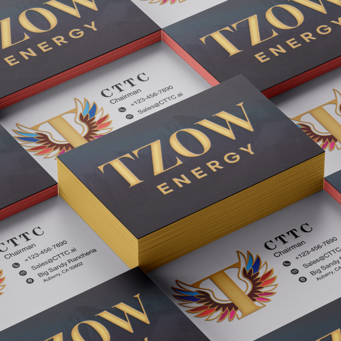
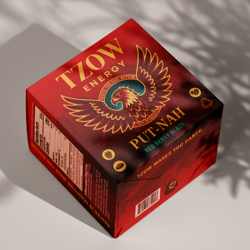
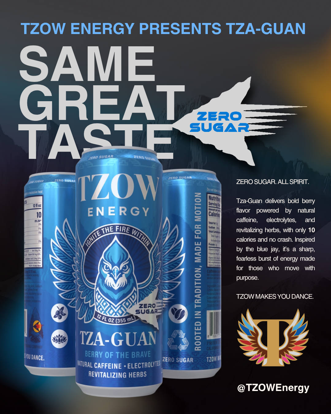
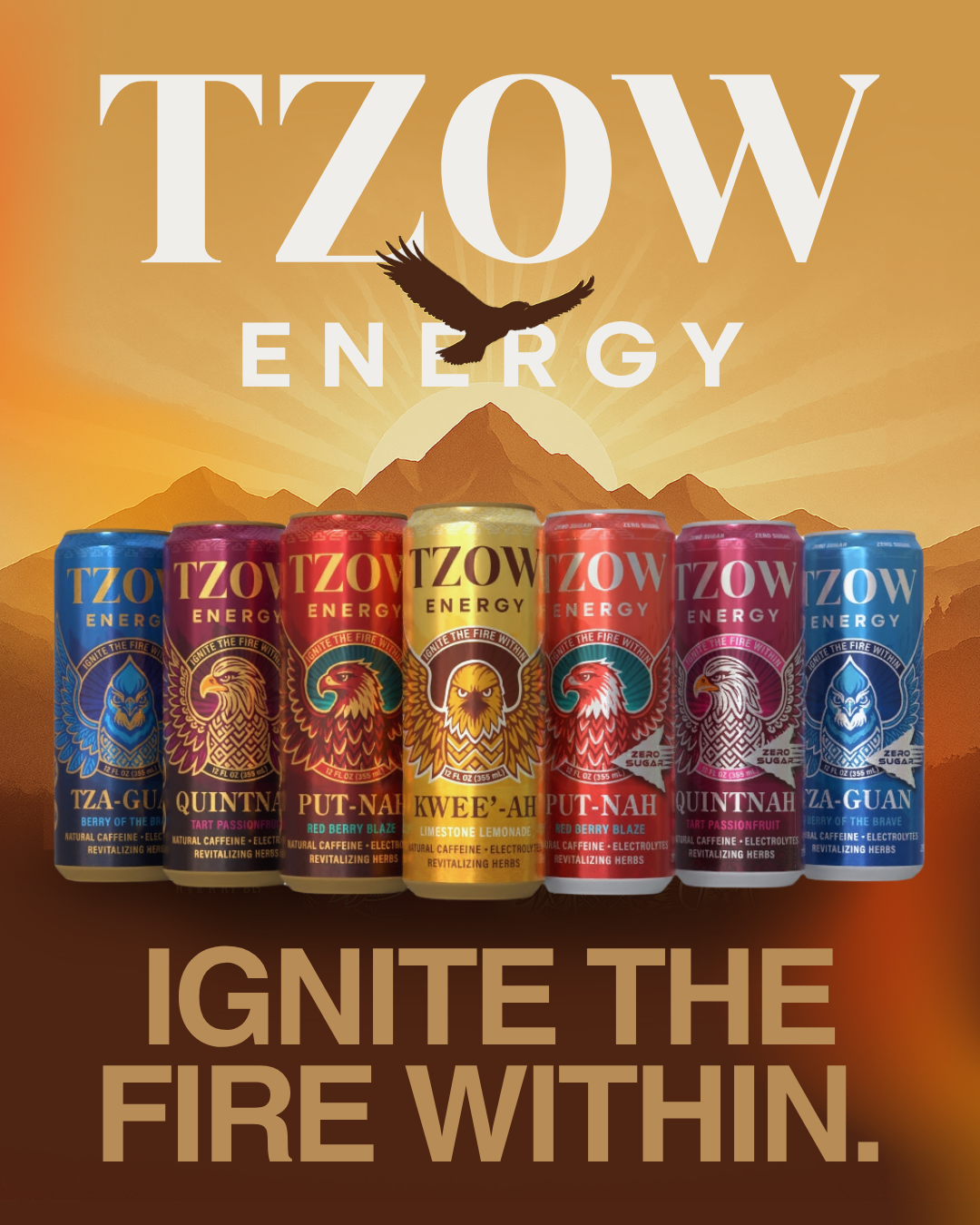
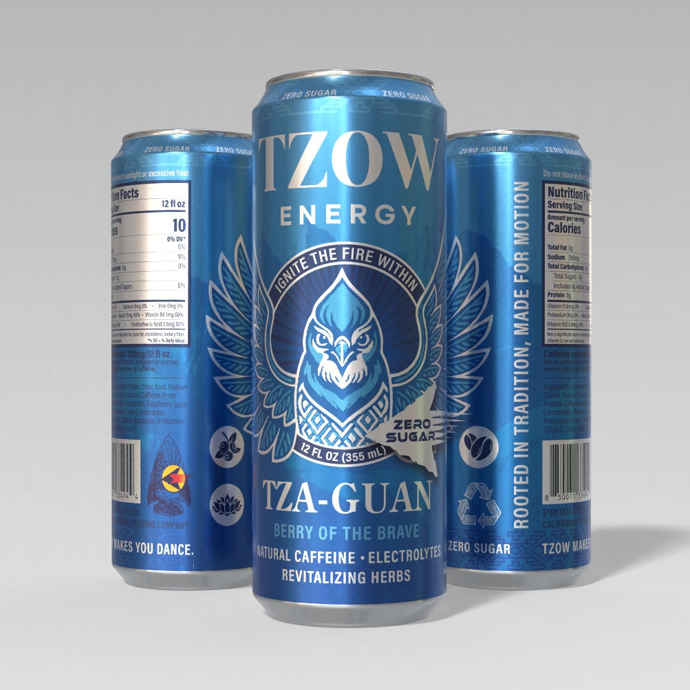
After extensive conversations with tribe leaders, we grounded the brand in their native language, cultural symbols, and artistic expression. The typography on TZOW Energy cans blends tradition and clarity through a thoughtful mix of serif and sans-serif fonts. The bold, custom serif, mirroring the “T” in the logo, is used for high-impact elements like the brand name, slogans, and flavor titles, evoking heritage and strength while honoring the visual rhythm of tribal lettering and storytelling. A complementary futuristic sans-serif font was introduced for the sugar-free line, giving those SKUs a cleaner, high-energy edge that communicates modern performance. Supporting details such as ingredients, descriptors, and nutritional information use a minimal sans-serif typeface for readability and balance, creating a clean hierarchy that feels both functional and expressive.
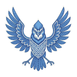
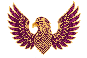
Through research, we discovered that sacred birds, dance, and mountains were universal symbols across the tribes, forming the foundation of our visual system. Each flavor was assigned a bird revered in Native storytelling, named in the Mono language, and paired with a backdrop featuring the mountain range surrounding the reservation. Traditional basket-weaving patterns frame the top and bottom of each can, connecting the brand’s modern energy to its ancestral roots. Finally, to reflect the cultural importance of rhythm and chant, we developed three slogans tying movement to meaning: “TZOW MAKES YOU DANCE,” “IGNITE THE FIRE WITHIN,” and “ROOTED IN TRADITION, MADE FOR MOTION.”