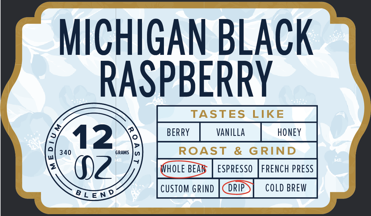
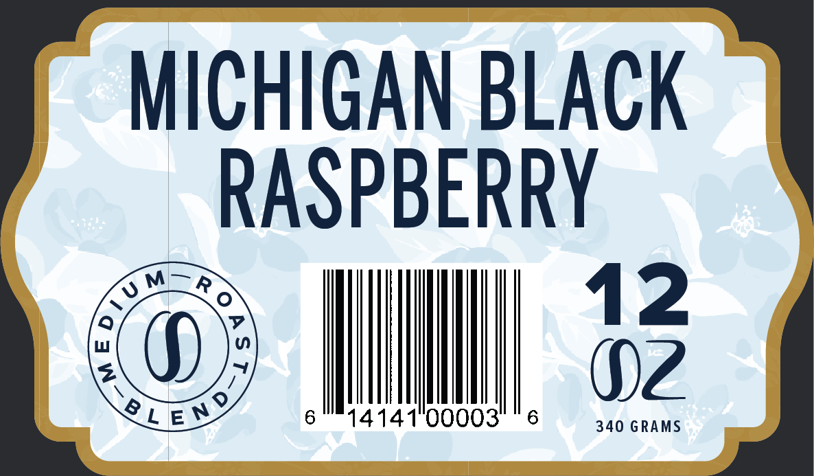
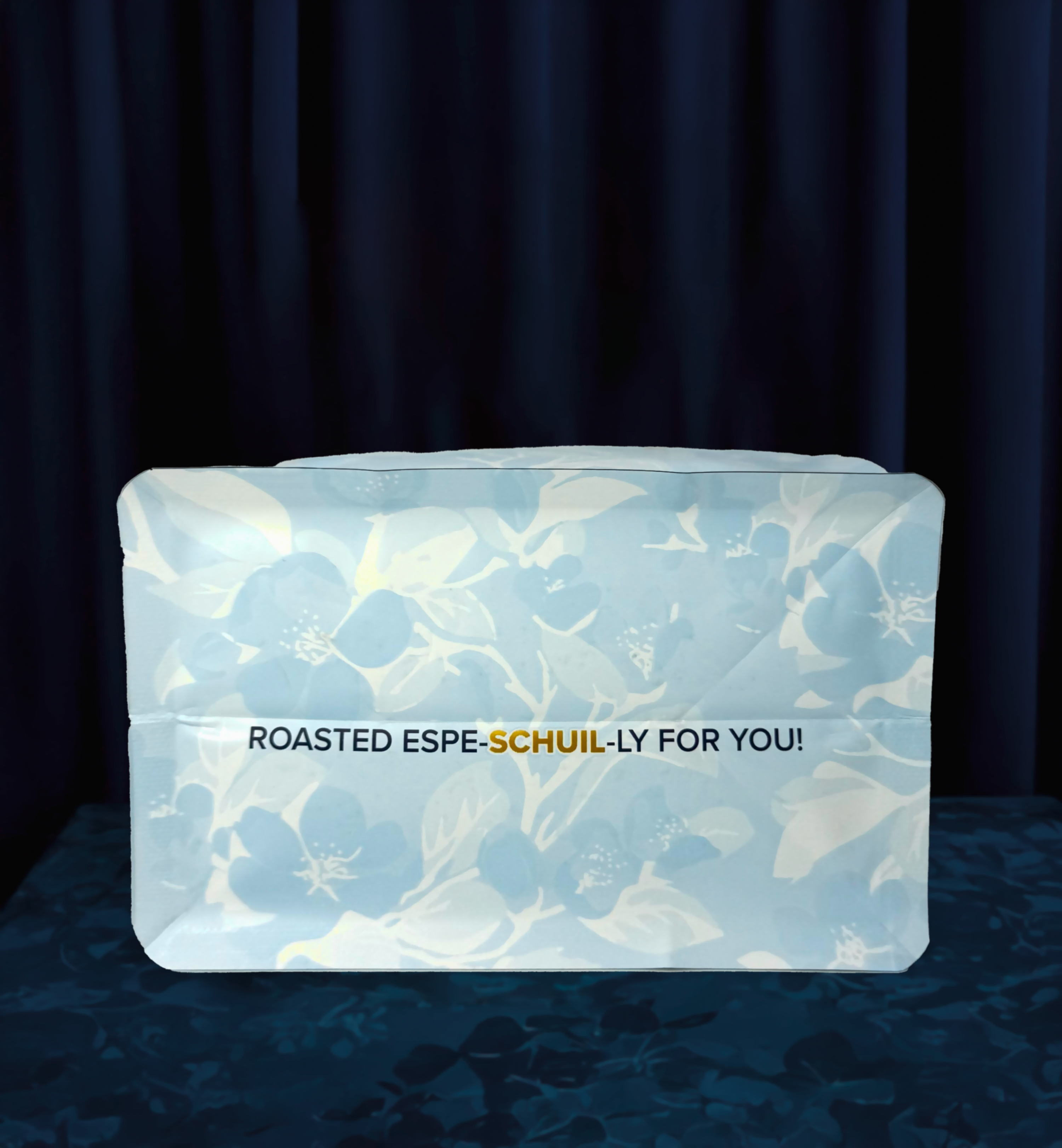
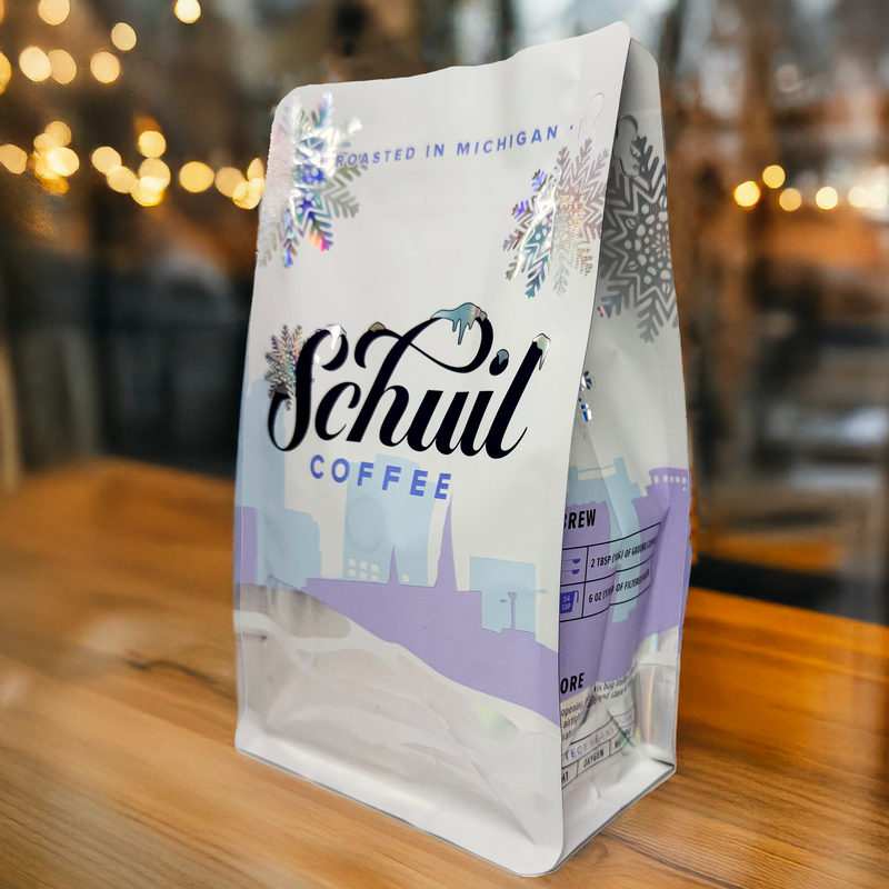
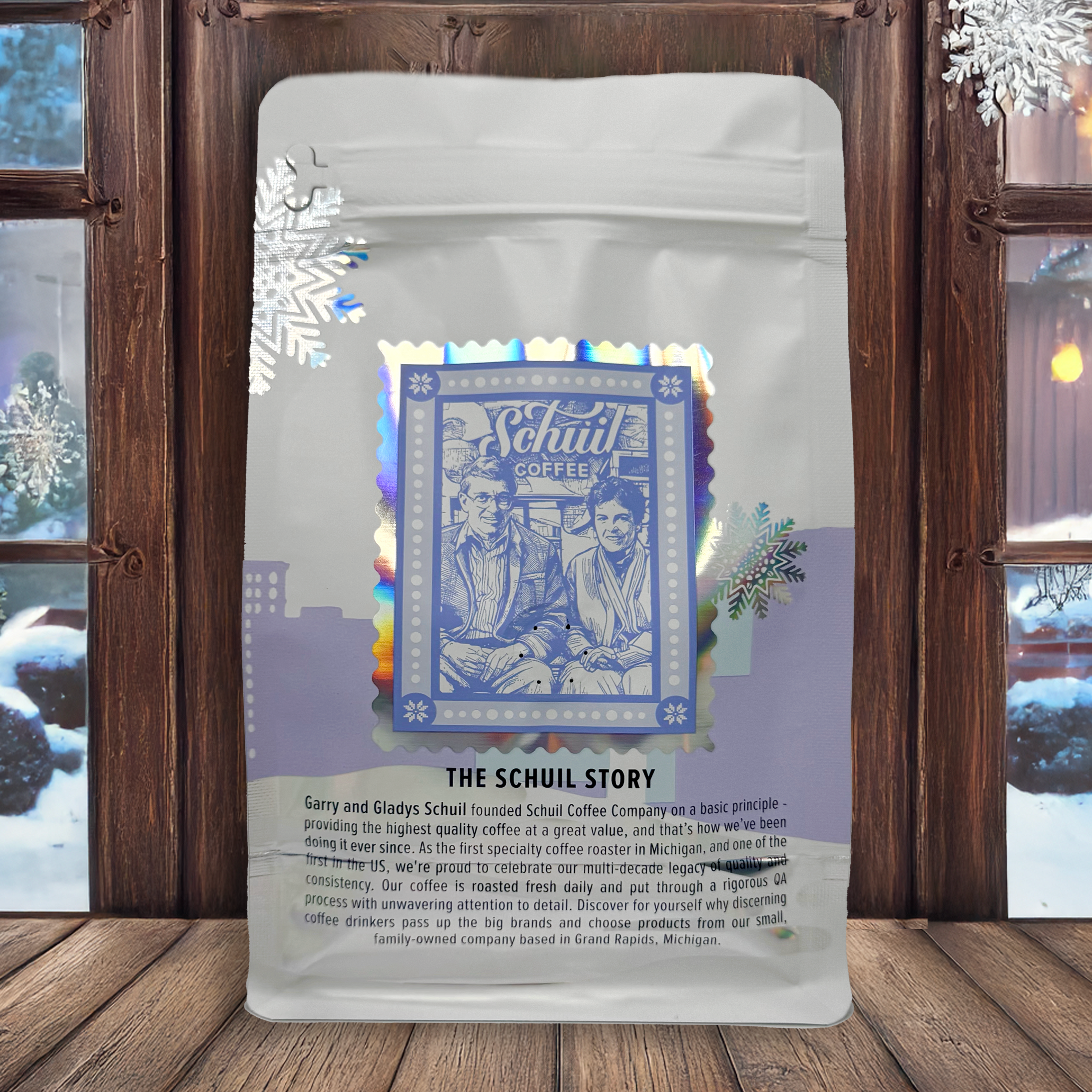
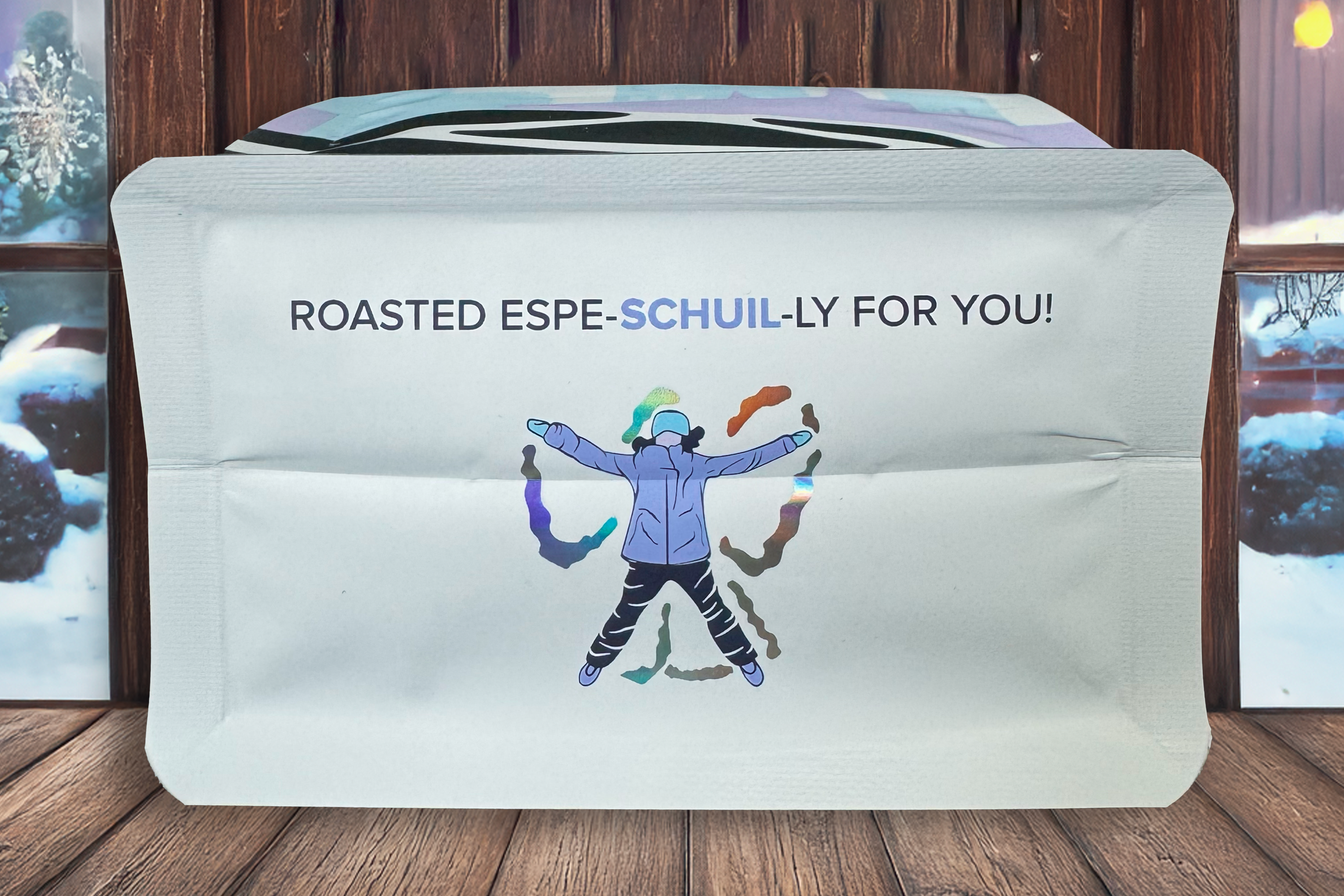
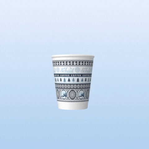
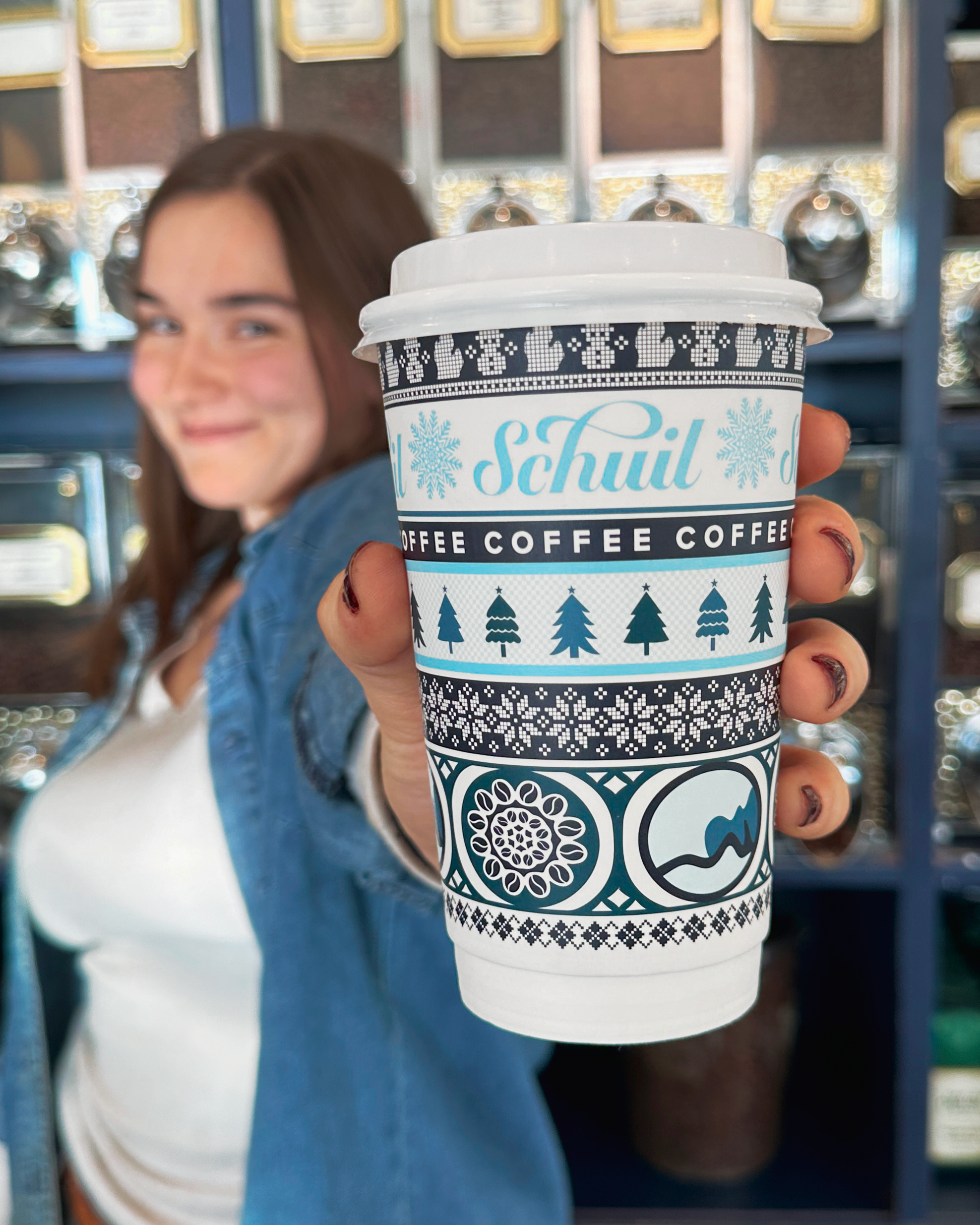
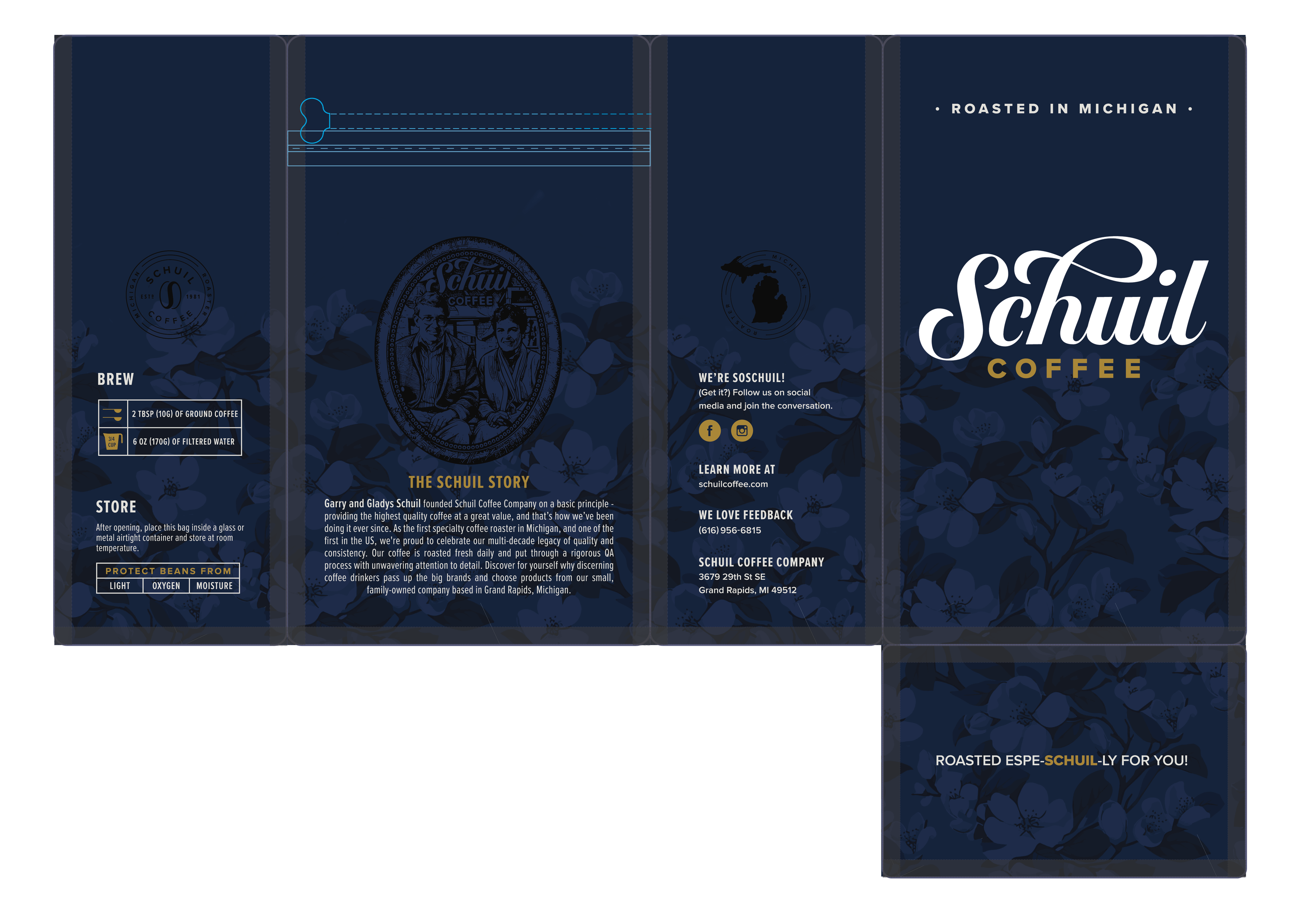
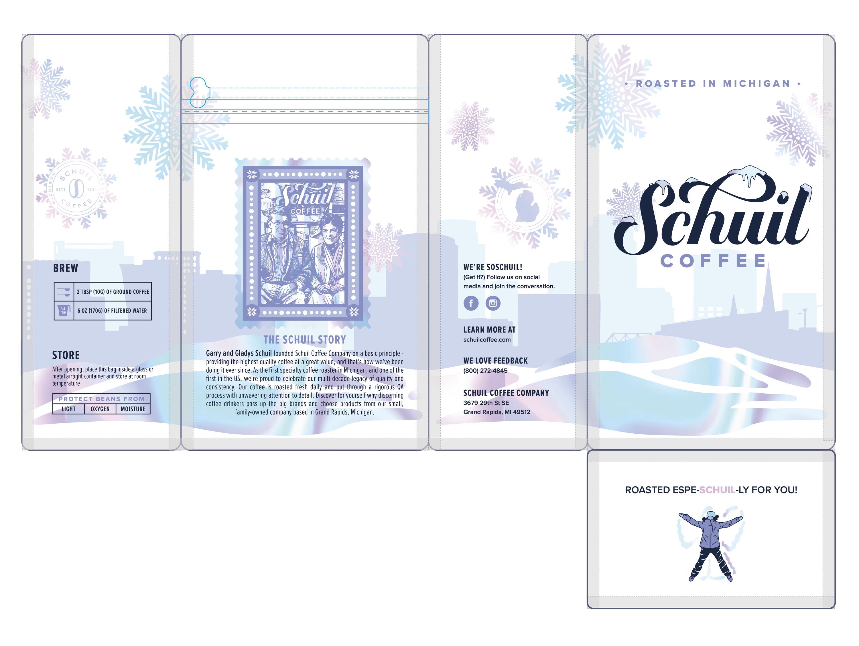
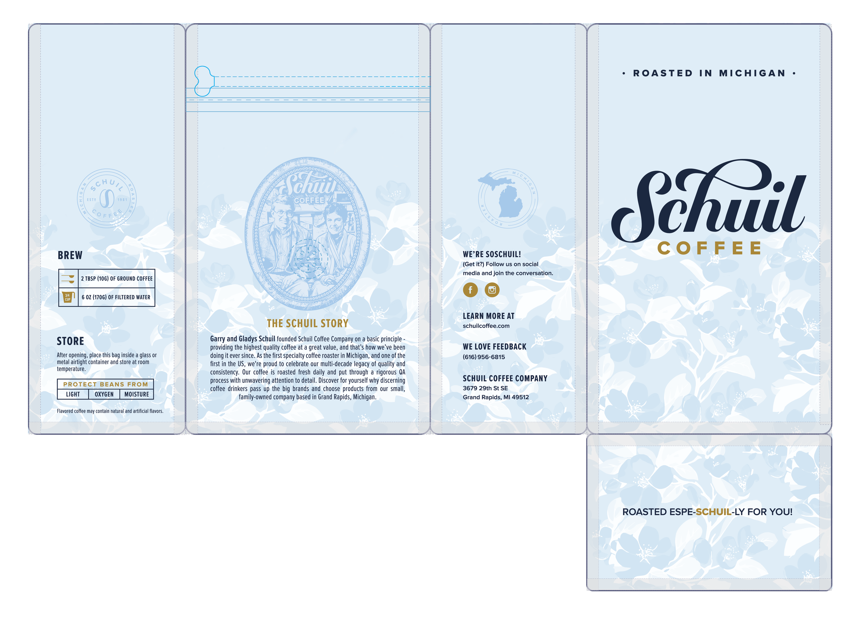
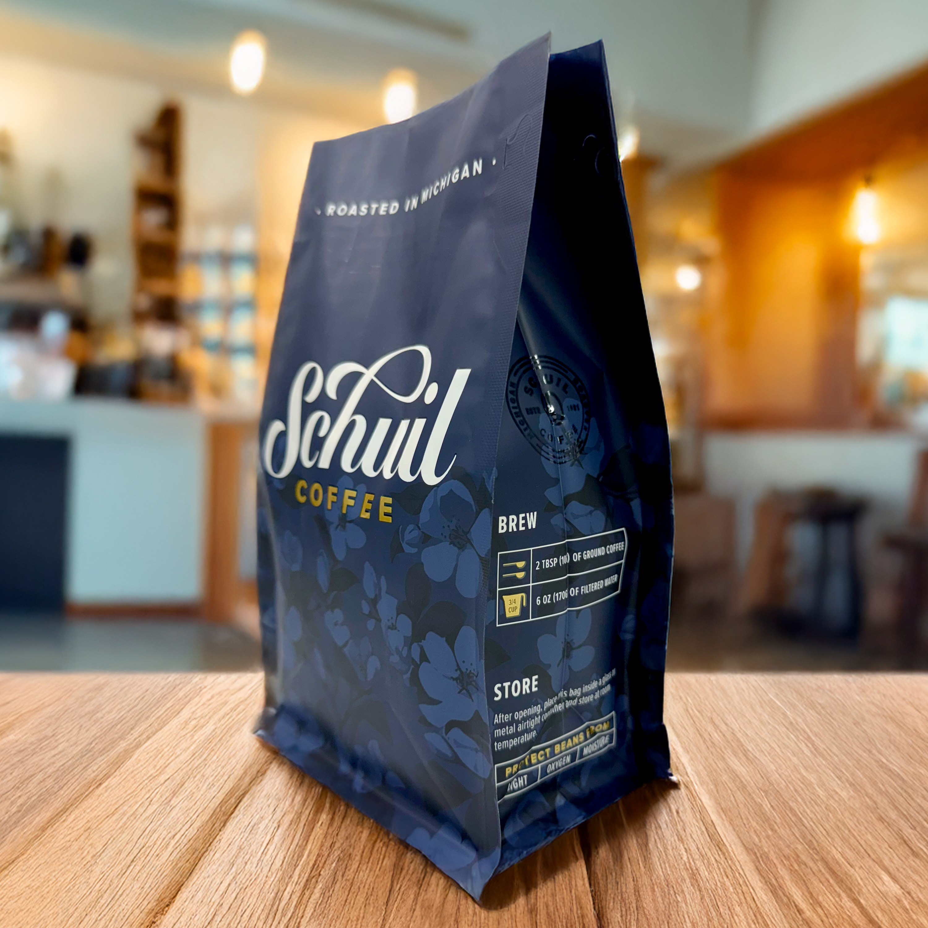
CLIENT BRIEF

Schuil Coffee, a beloved Michigan-based roaster, approached PCKG to refresh their coffee bags for the first time in over two decades. While the brand wanted to honor the legacy of its founders and maintain its recognizable heritage, the goal was to introduce a more delicate, fun, and quirky design language that reflects the warmth and charm of Schuil’s local cafés. The new packaging needed to balance tradition with personality, modernizing the look through thoughtful color and illustration while keeping the brand’s community-driven spirit at its core.

Client
Schuil Coffee
Year
2025
Services
Packaging Design (Core 12oz & 5lb) Packaging Design (Holiday Bags + Hot Cups)
Industry
Food & Beverage, Small Business

PROJECT DESCRIPTION

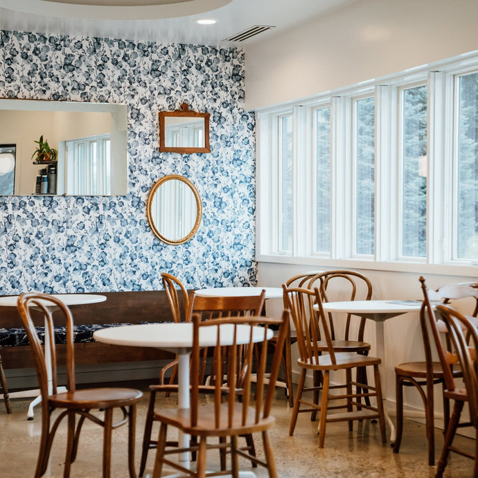
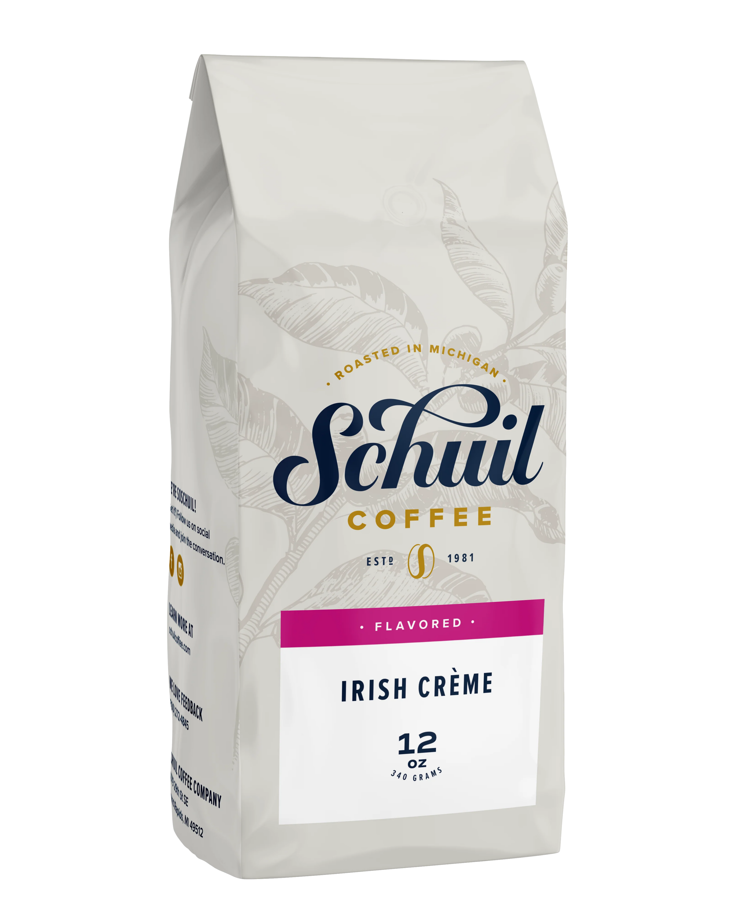
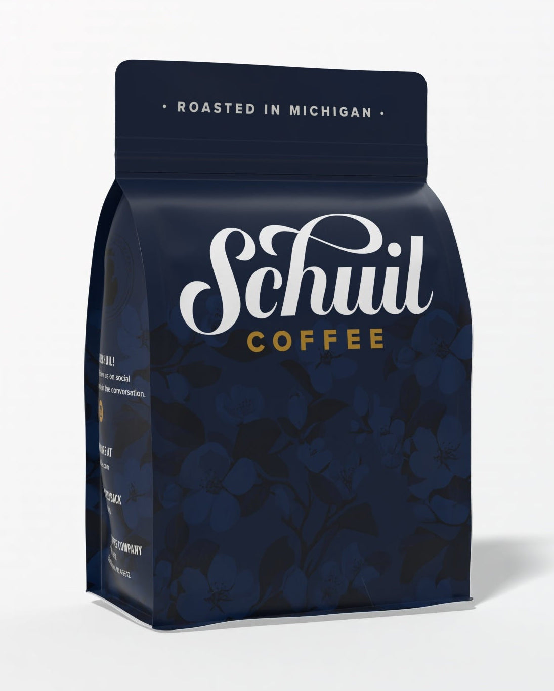
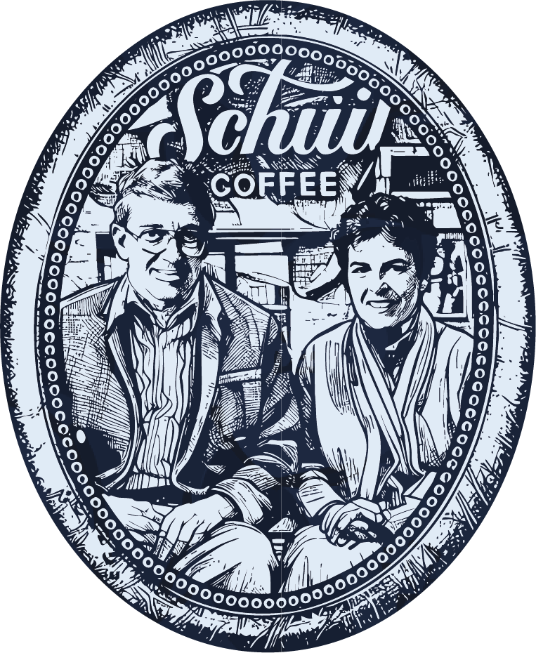
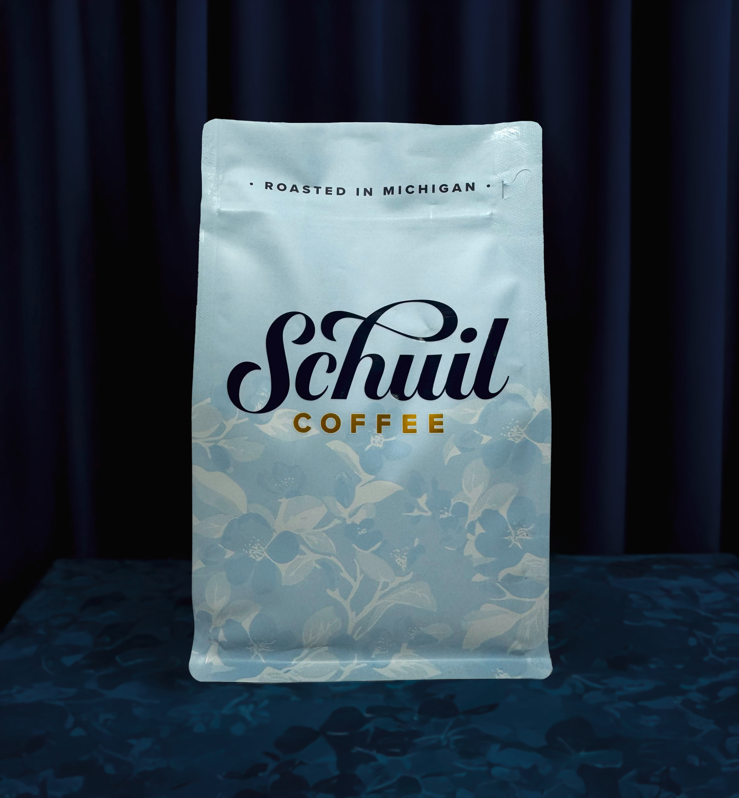
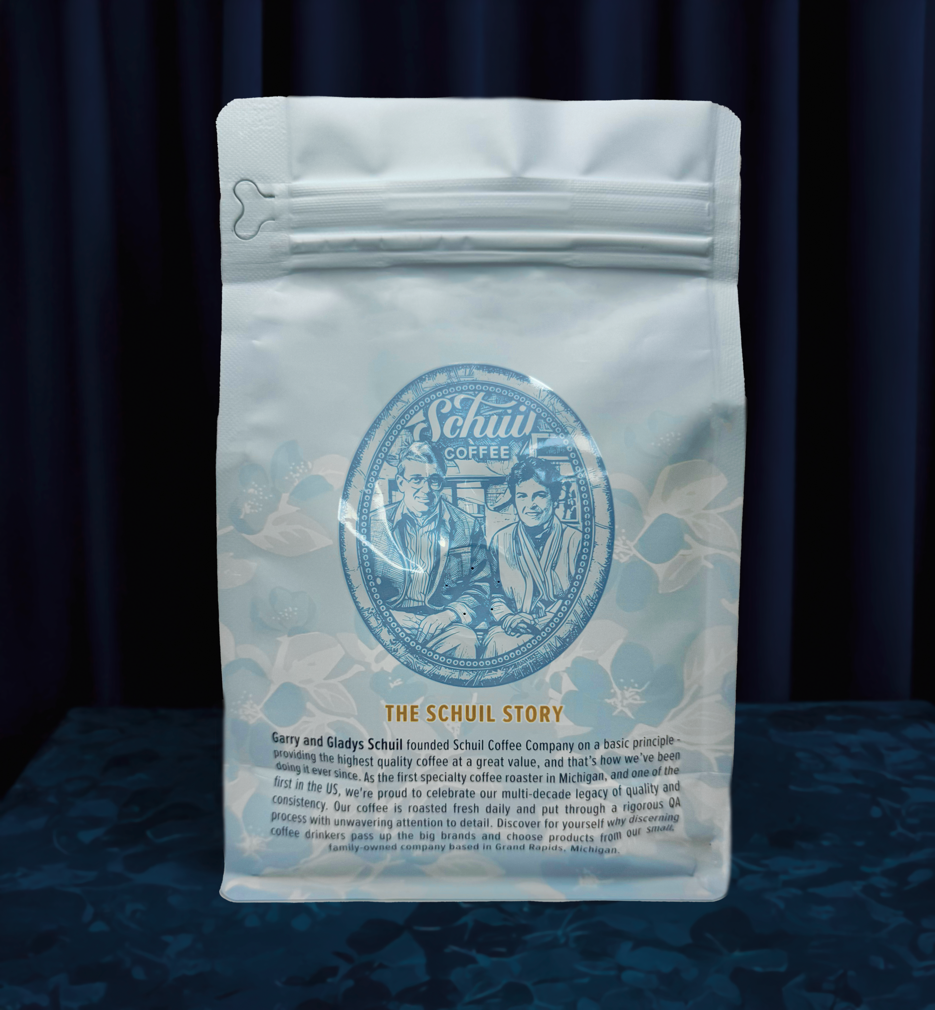
For the redesign of Schuil’s original coffee bags, we drew inspiration directly from the atmosphere of their Michigan cafés. From the delicate floral wallpaper to the mismatched frames and vintage mirrors, the space feels both nostalgic and personal. To capture that charm, we introduced a ghost-printed floral pattern featuring apple blossoms, Michigan’s state flower, which creates subtle texture and a sense of place. The previous packaging featured a sketch of founder Garry, which the new owners wanted to preserve as a nod to the brand’s roots. We reimagined this illustration to include Garry and his wife, Gladys, sitting on a bench outside their original store, honoring the founding couple and tying back to the café’s old-school photography aesthetic that’s been part of Schuil’s story for over 40 years.

SCHUIL HOLIDAY PROGRAM

Schuil’s holiday program was designed to bring a playful and festive twist to their seasonal packaging. The brand wanted the holiday bags to feel joyful and distinct, incorporating holographic foil elements that shimmered across the design to capture the magic of the season. For their café cups, the vision centered on a custom fair isle pattern inspired by both the roastery and the city of Grand Rapids, Michigan, blending local pride with classic holiday warmth. The result was a cohesive seasonal collection that felt celebratory, elevated, and unmistakably Schuil.

  • DETAIL #1
    The Schuil holiday design featured holographic snowcaps layered over the wordmark, paired with custom holographic snowflakes that subtly incorporated coffee beans into their patterns. Along the base of the bag, holographic snow mounds add depth, shimmer, and a festive winter charm that ties the whole design together.
  • DETAIL #2
    A two-color vector illustration of the Grand Rapids skyline wraps seamlessly around all four sides of the bag.
  • DETAIL #3
    The illustration of Garry and Gladys was removed from the classic bag’s “picture frame” and reimagined as a holiday stamp, complete with holographic foil edges for a festive touch.
  • DETAIL #4
    On the bottom of the bag, a fictional Grand Rapids local and longtime Schuil customer is depicted playfully making a snow angel, blending into the white and holographic bottom panel for a whimsical, lighthearted detail.

Holiday Hot Cups

The hot cups feature a custom Fair Isle pattern inspired by classic winter knitwear, incorporating playful motifs like the Grand Rapids flag, snowmen, snowflakes, trees, and argyle details for a cozy, hometown feel.

  • FINAL APPROVED DESIGNS

    The PCKG team produced the approved bag designs for both 12oz flat bottom bags, 5lb center seal bags, frac packs, and hot cups.
  • SHOP THIS COFFEE

    Our customers put as much love into their coffee as they do into their brand, so why not taste it for yourself and see how good design and great coffee come together?