PROJECT DESCRIPTION
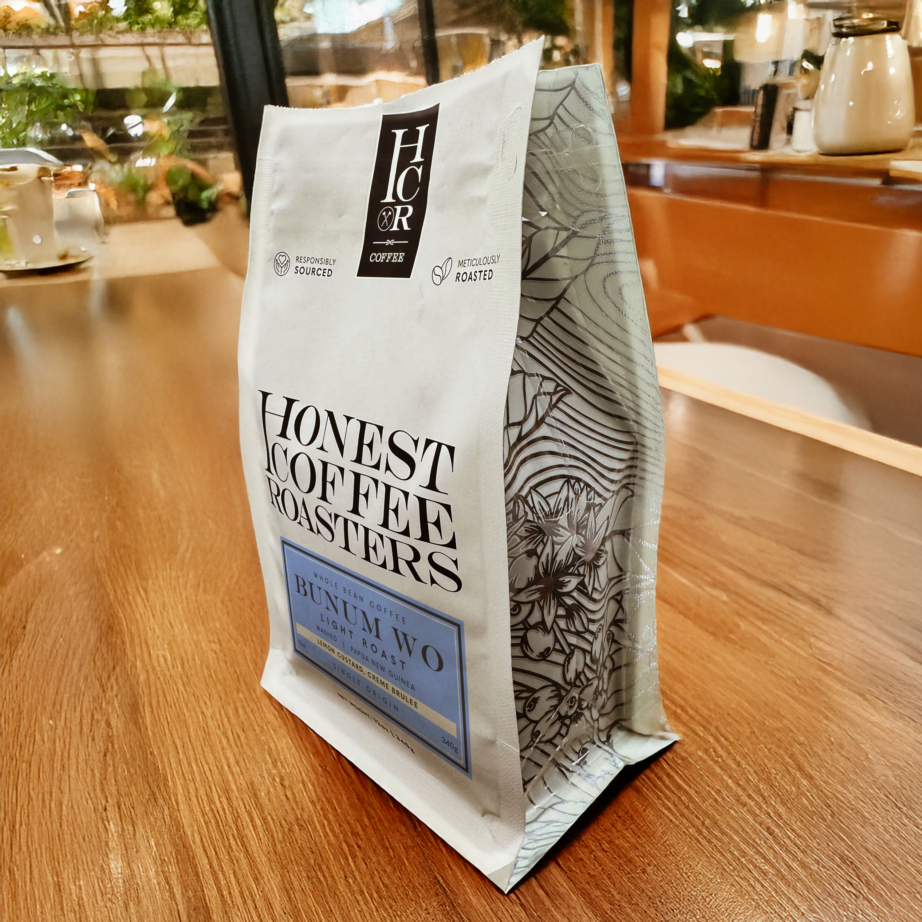
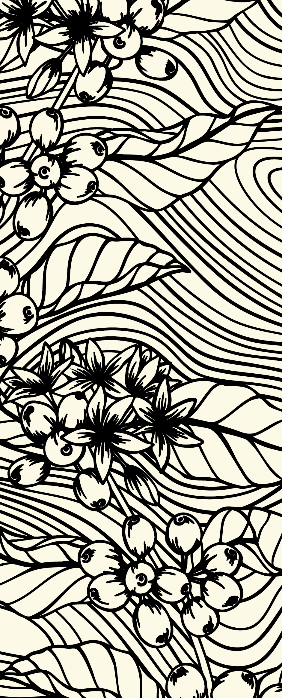
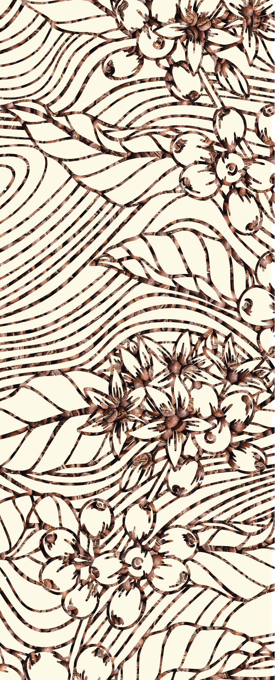
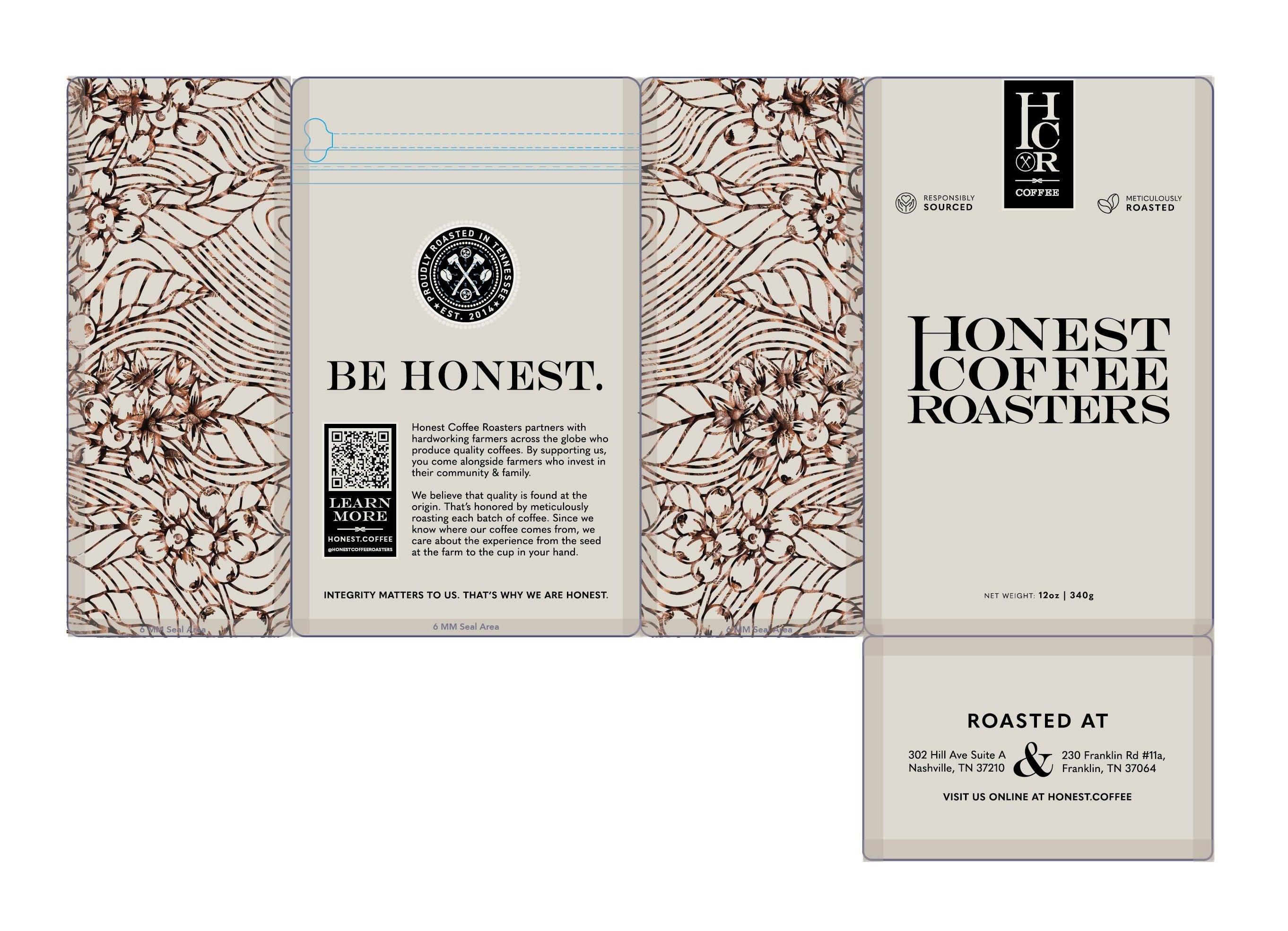
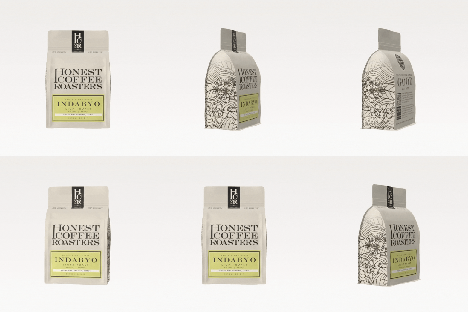
To capture Honest Coffee Roasters’ down-to-earth personality and natural surroundings, we developed a hand-drawn illustration of a coffee plant incorporating subtle geode linework, a nod to the organic forms and natural beauty that surround the brand. This illustration became a transparent knockout window on the bag, allowing customers to see the beans inside and reinforcing Honest’s commitment to transparency and authenticity.
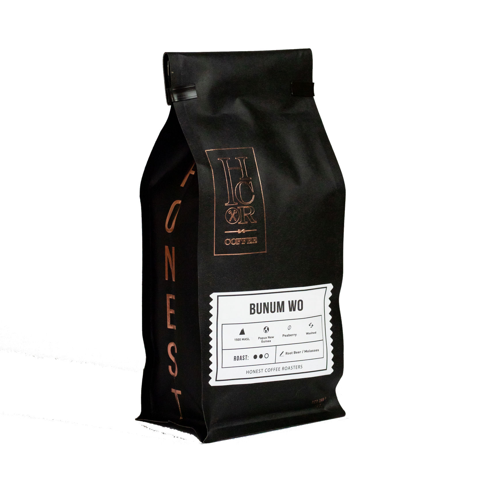
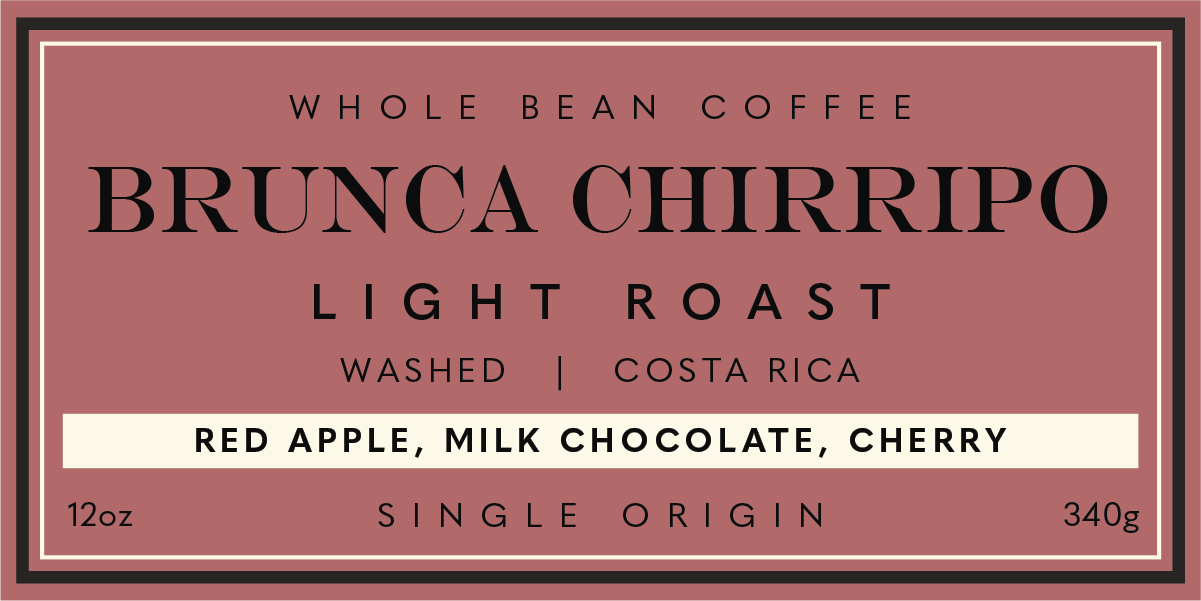
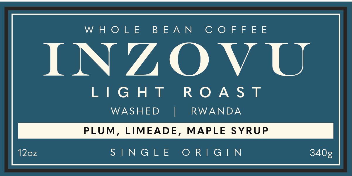
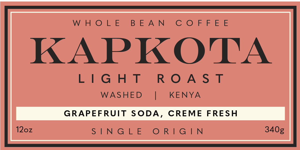
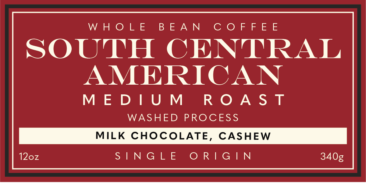
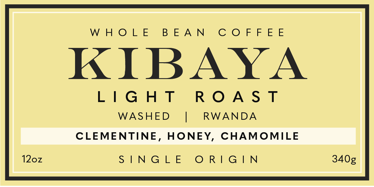
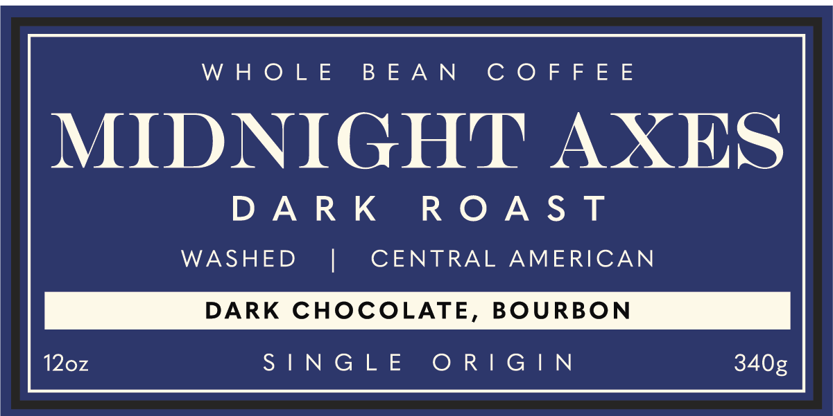
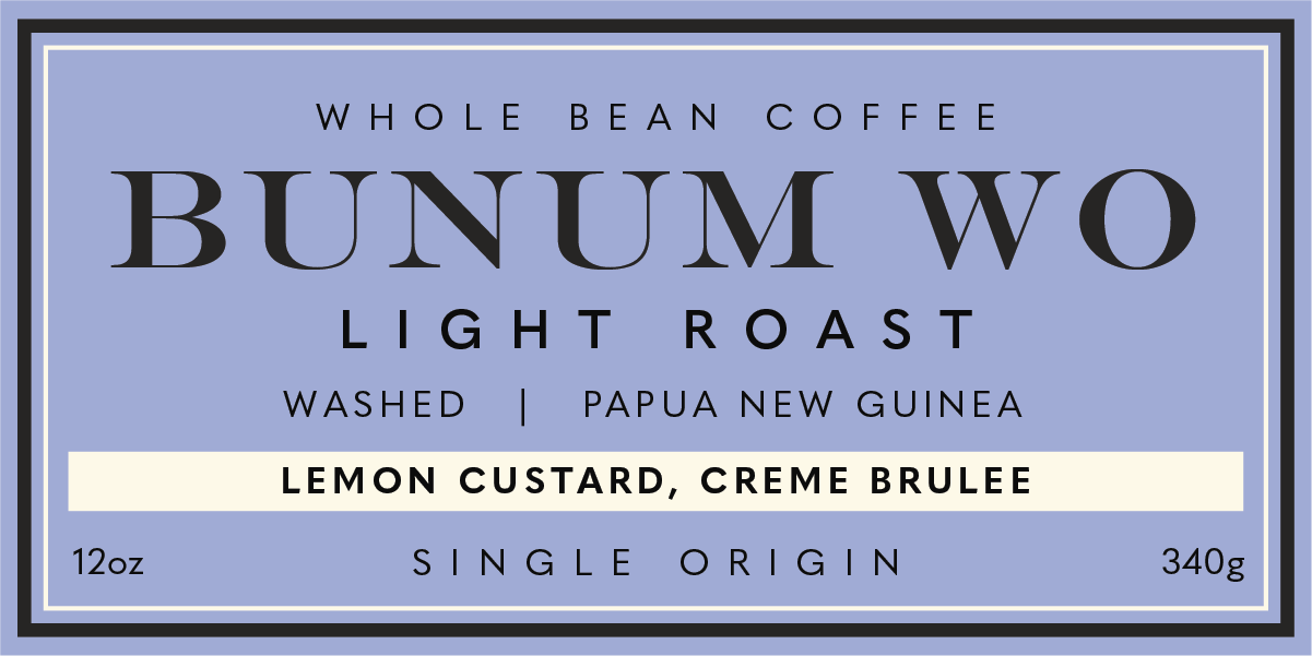
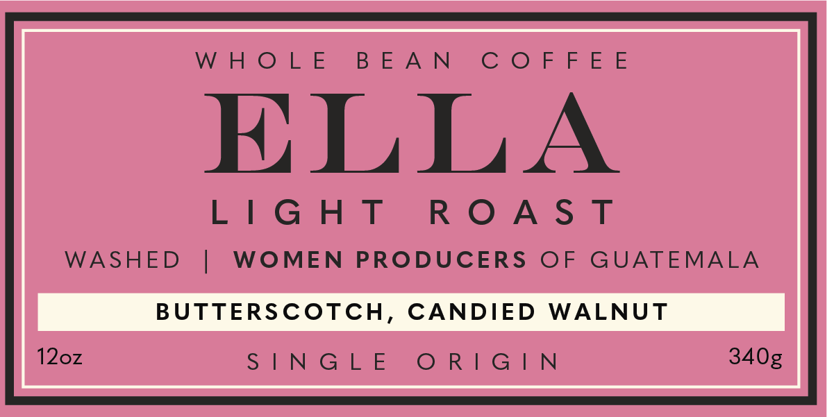
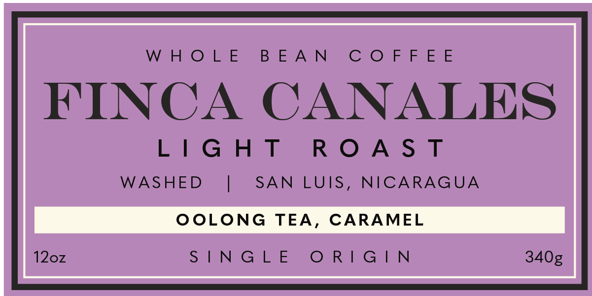
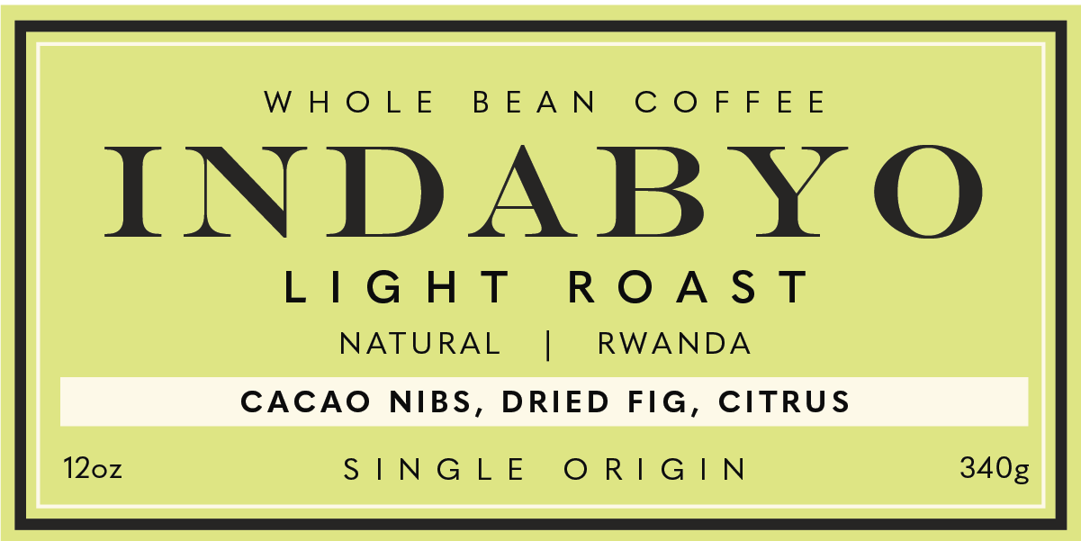
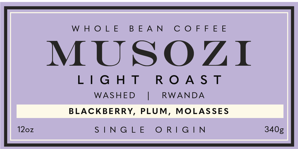
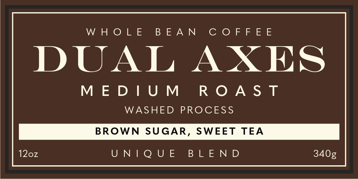
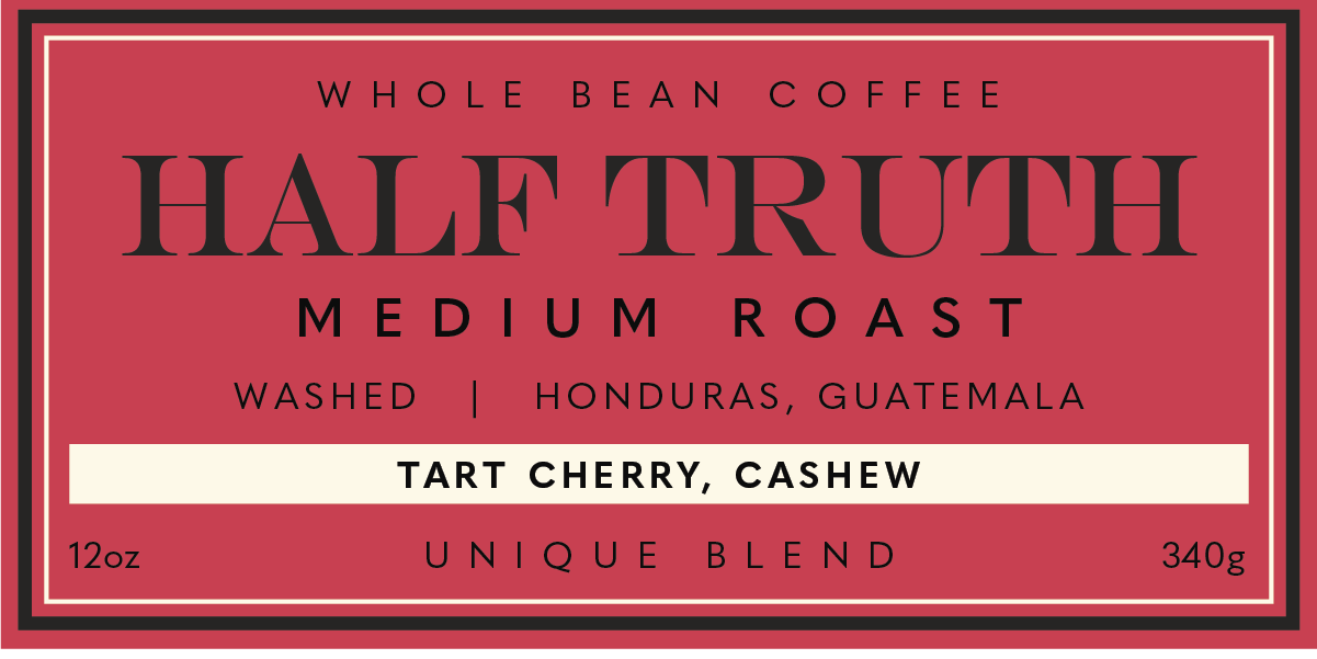
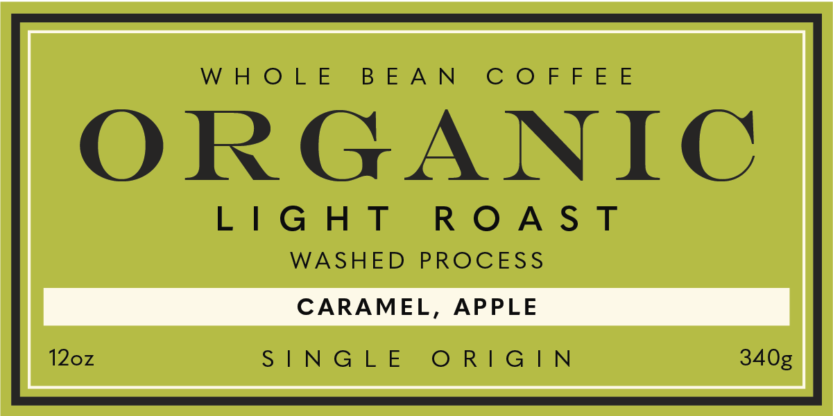
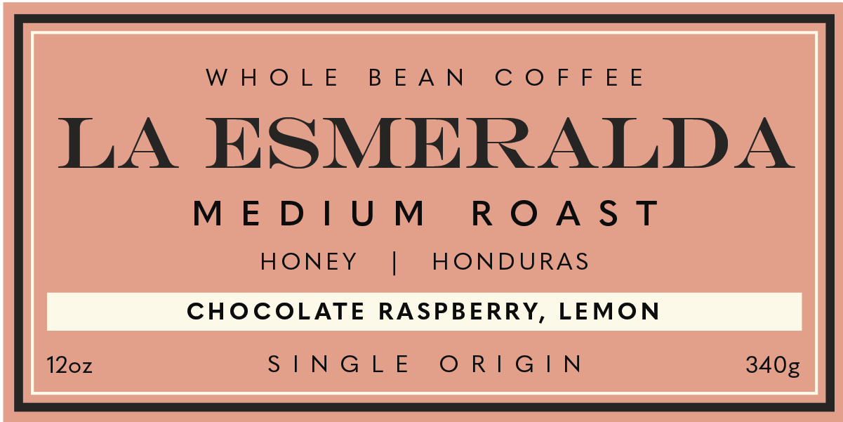
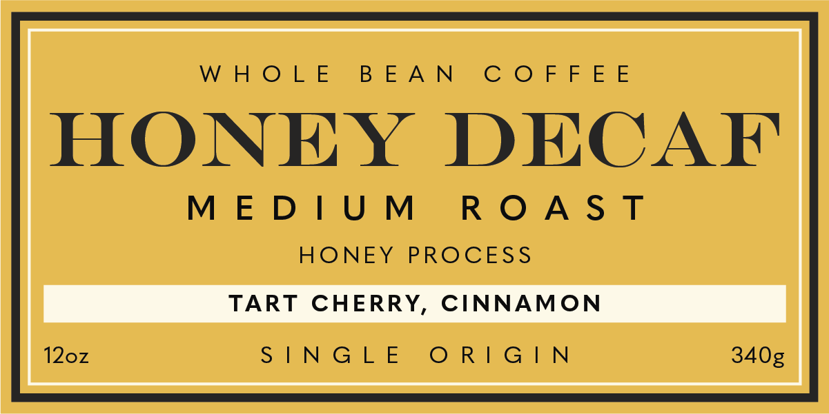
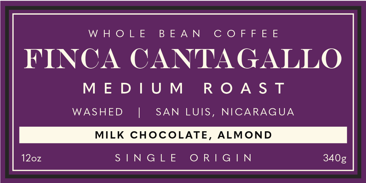
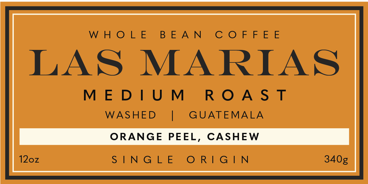
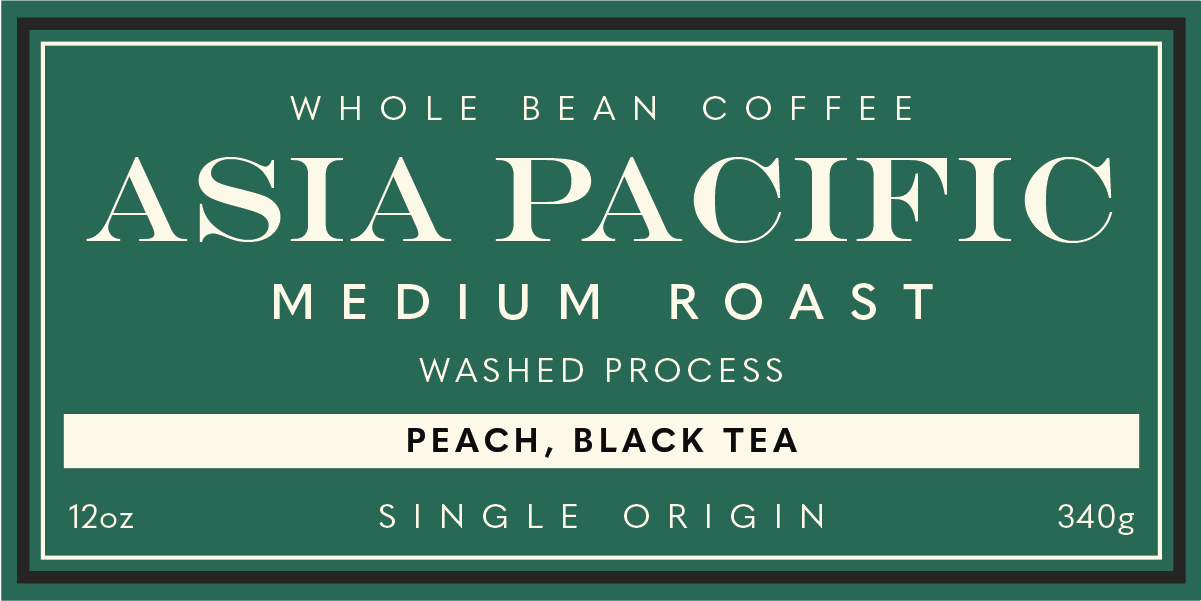
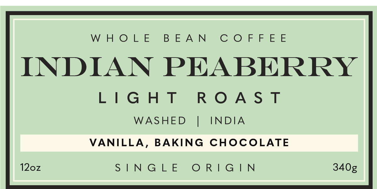
We selected a light cream tone for the bag’s body, warm and natural enough to feel approachable, yet bright enough to stand out on the shelf without the starkness of pure white. The label system follows a unified layout with an array of vivid, high-contrast colors that differentiate each blend while adding a lively, modern pop to the overall presentation. Together, these elements create packaging that feels fresh, honest, and unmistakably connected to the brand’s roots and community-driven values.

